Objective
Assigned a random combination of either a letter/letter, letter/number, or number/number, I was challenged to design a logo and then develop a fictional company within an industry that represents the look and feel of the logo. I was assigned the letter "b" and the number "15," then I sketched logo ideas and associated the final logo with the apartment industry. Following this logo was a brand guide for the company, then collateral, and finally a website.
Brand Guide
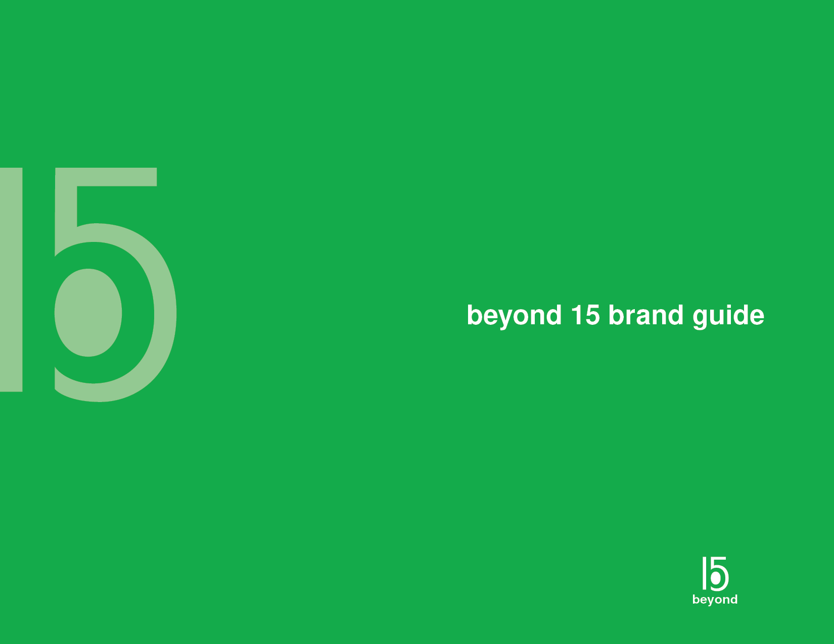
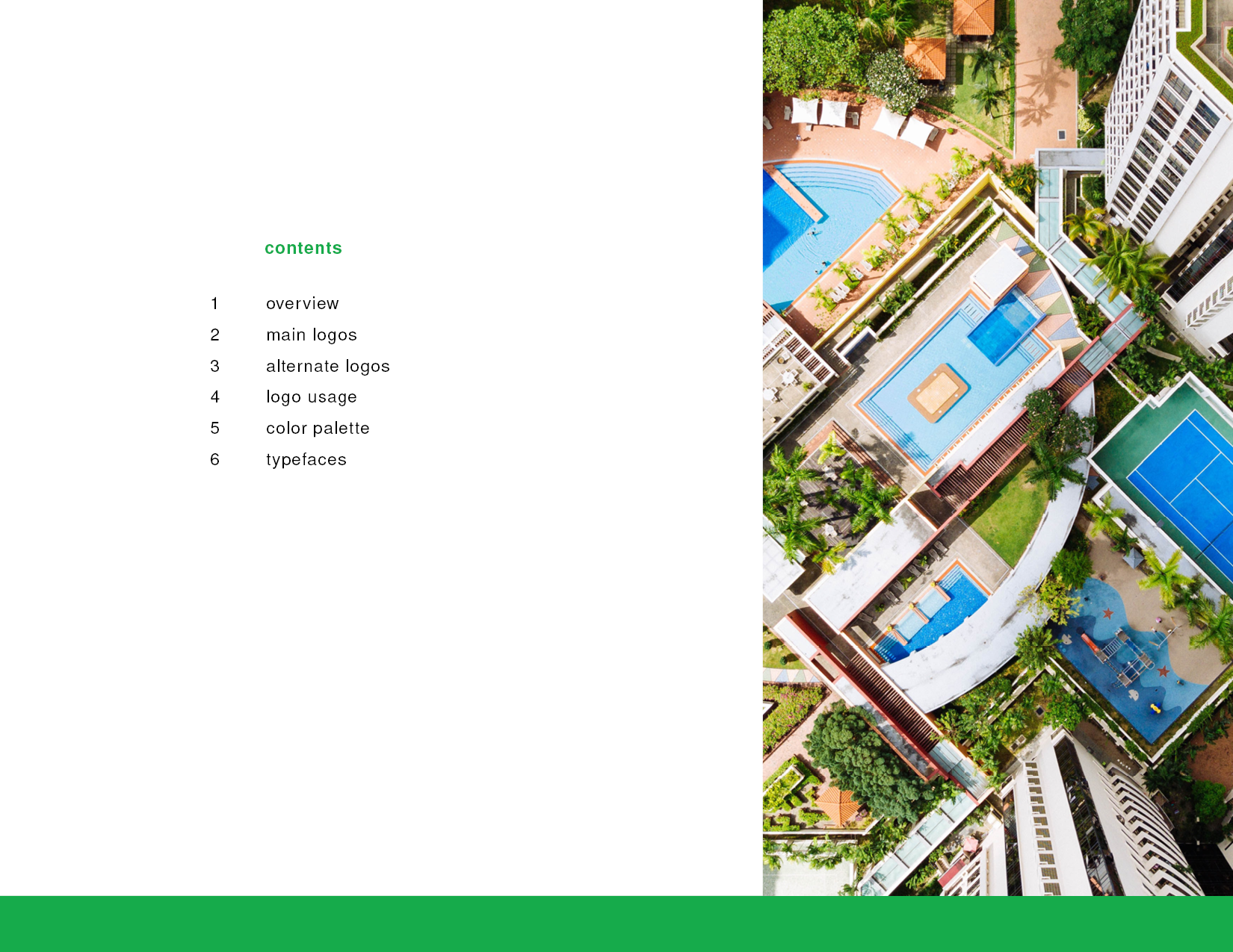
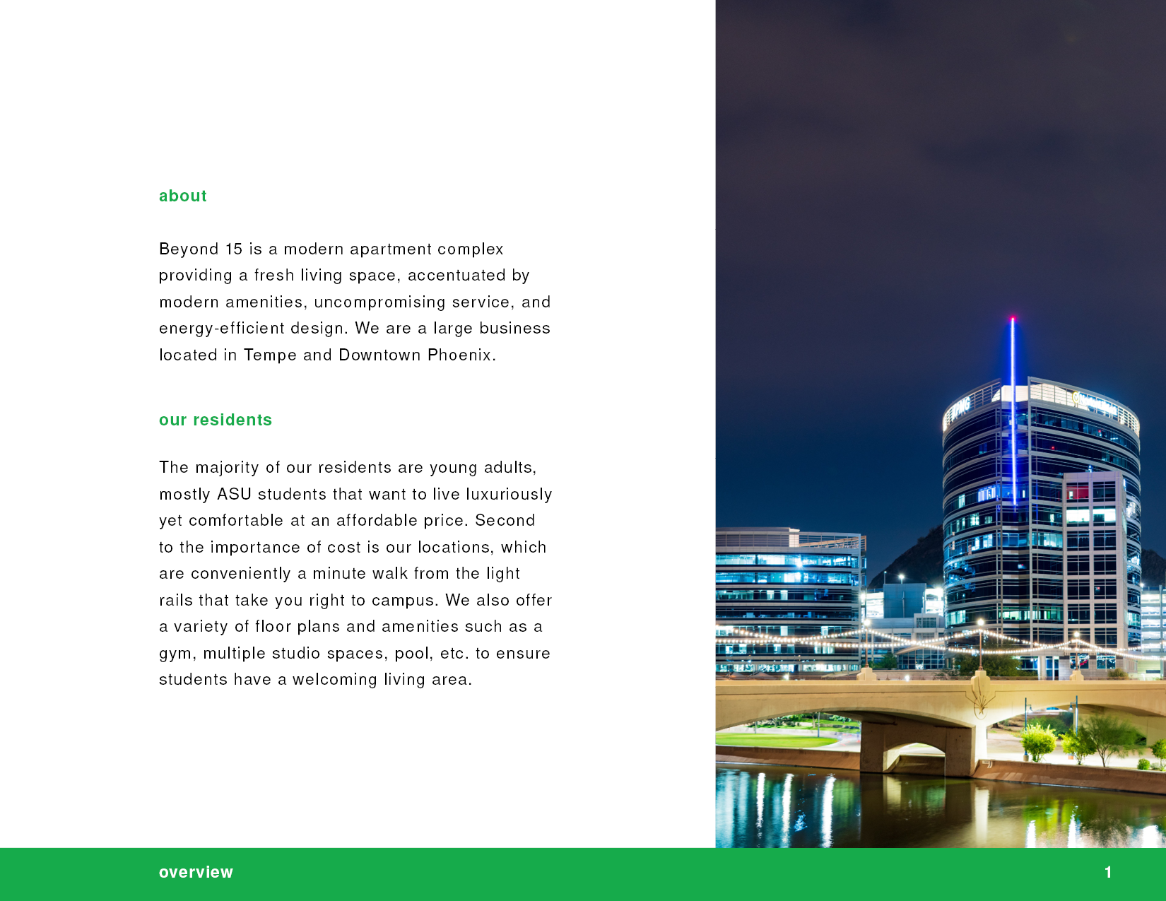
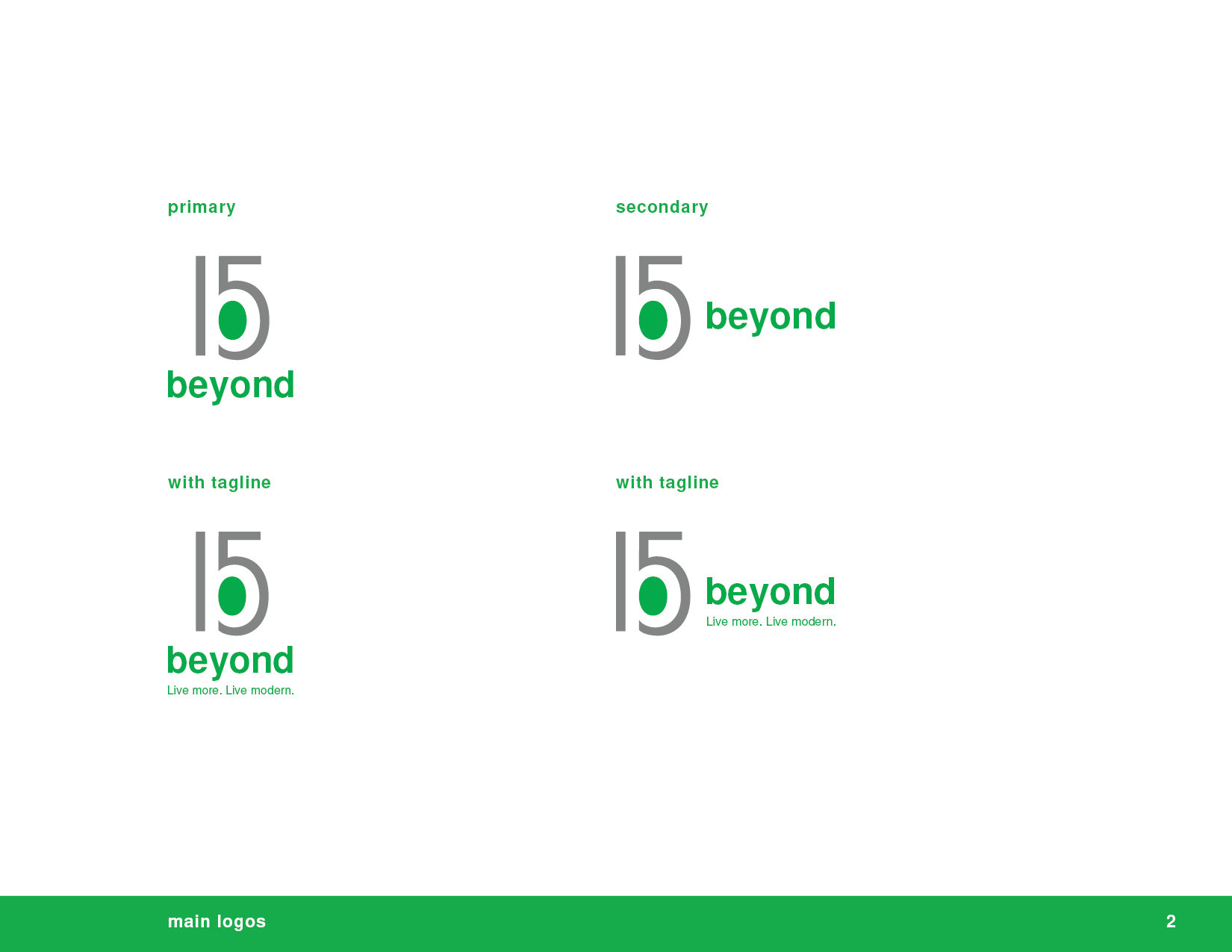
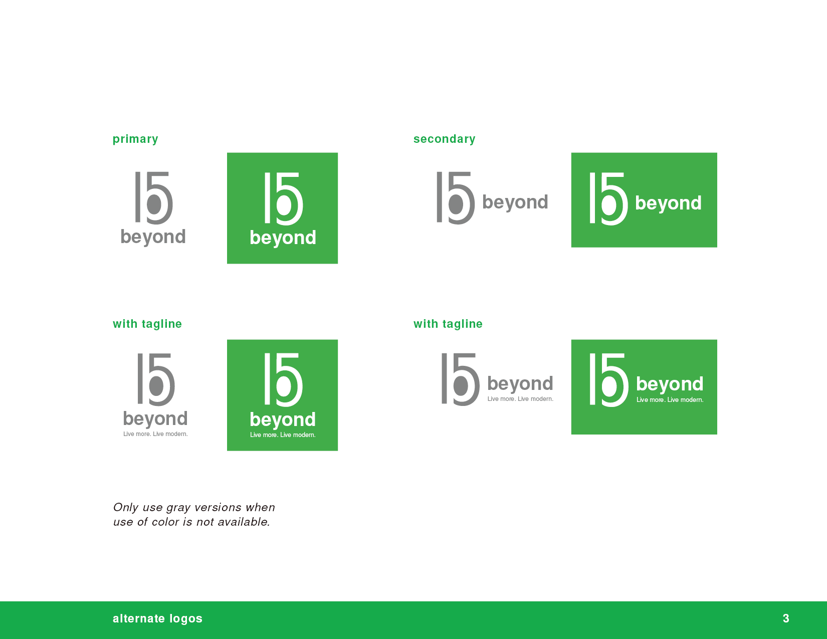
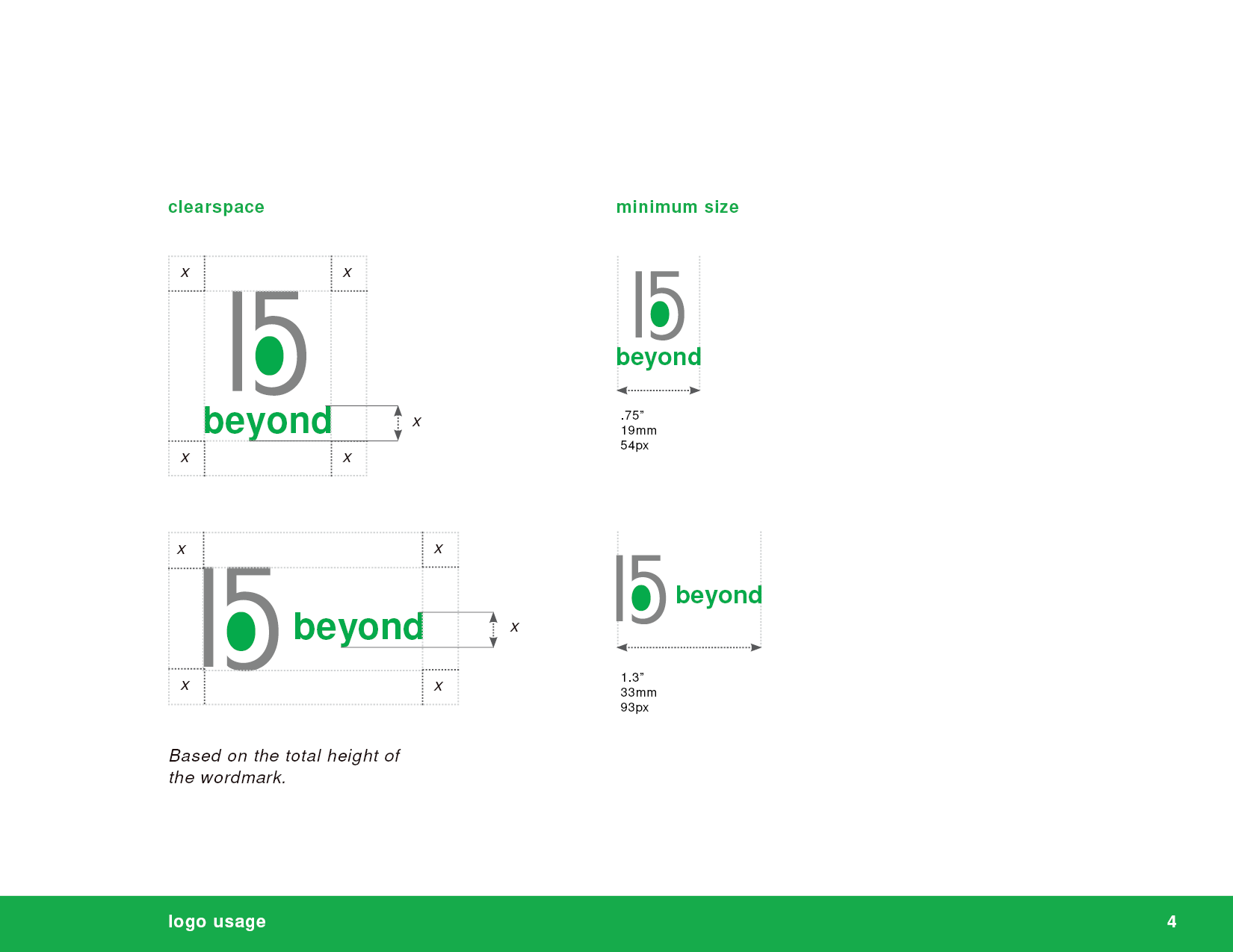
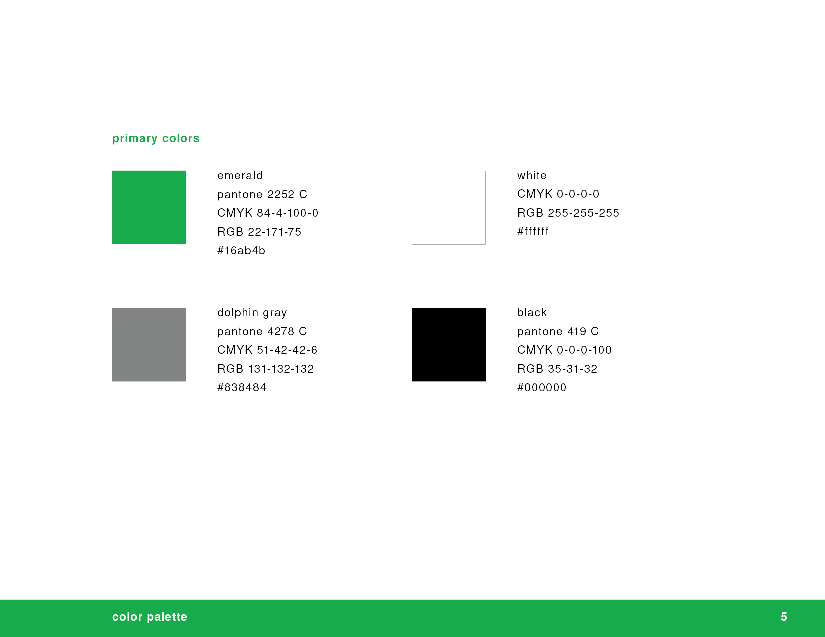
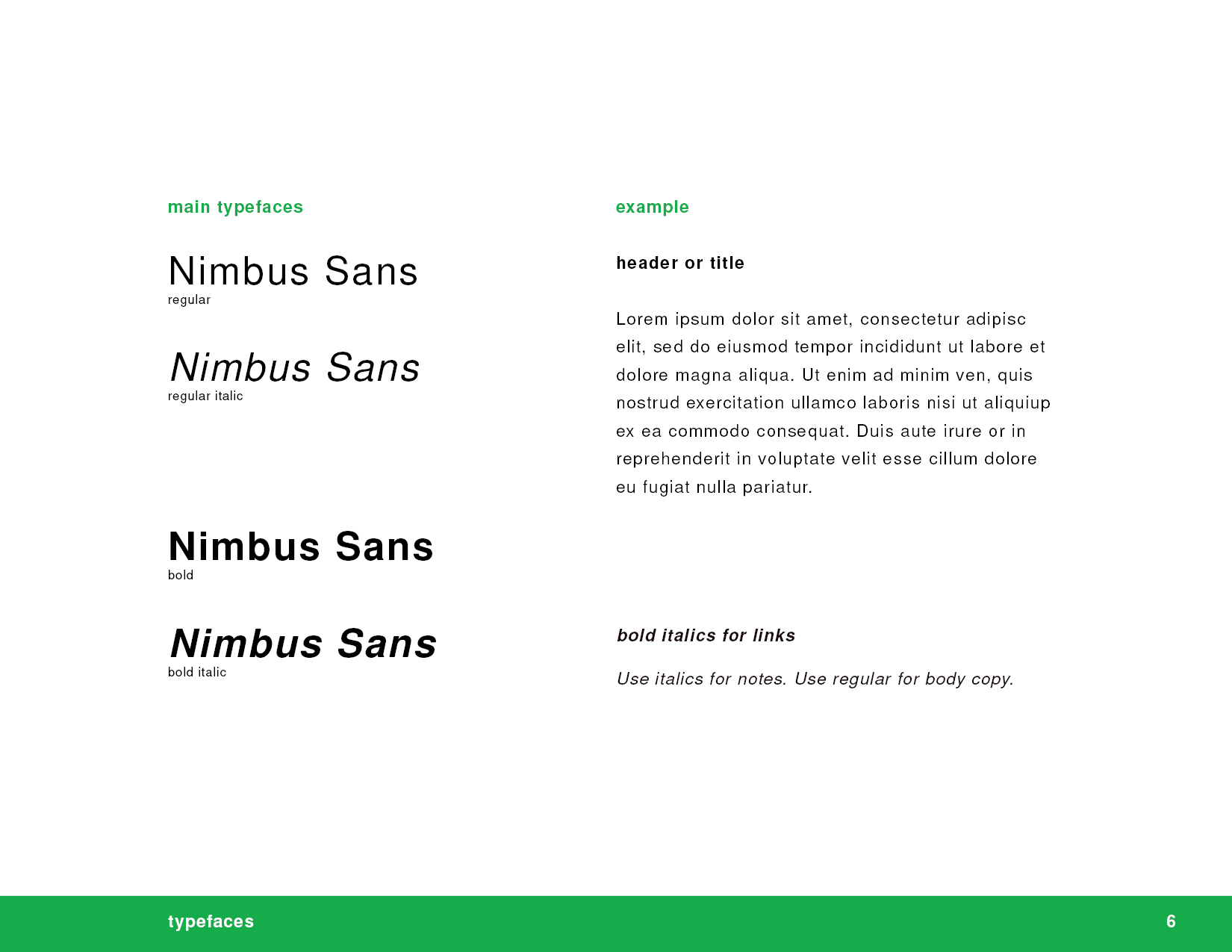
The brand identity for the modern apartment complex is modern, sleek, and sophisticated. Beyond15 appeals to urban dwellers who value style and convenience. The brand feels approachable and welcoming, while still communicating a sense of luxury.
Business System
The letterhead, envelope, and business card for beyond15 are consistent with the brand's overall design and messaging. By creating a strong and cohesive brand identity across all materials, the apartment complex can help build trust and recognition among potential residents and other stakeholders.
Welcome Gifts
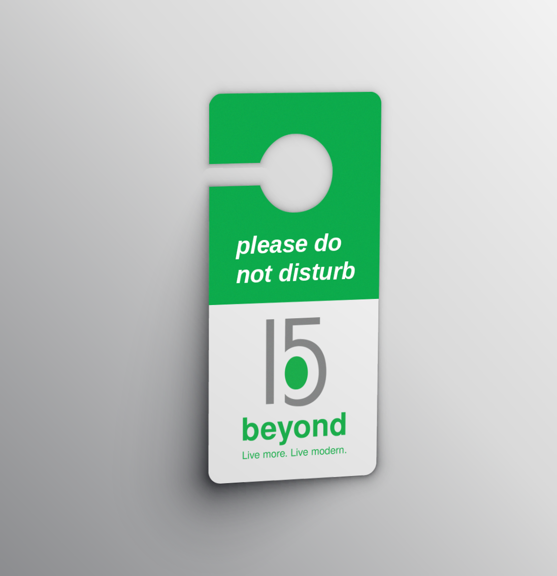
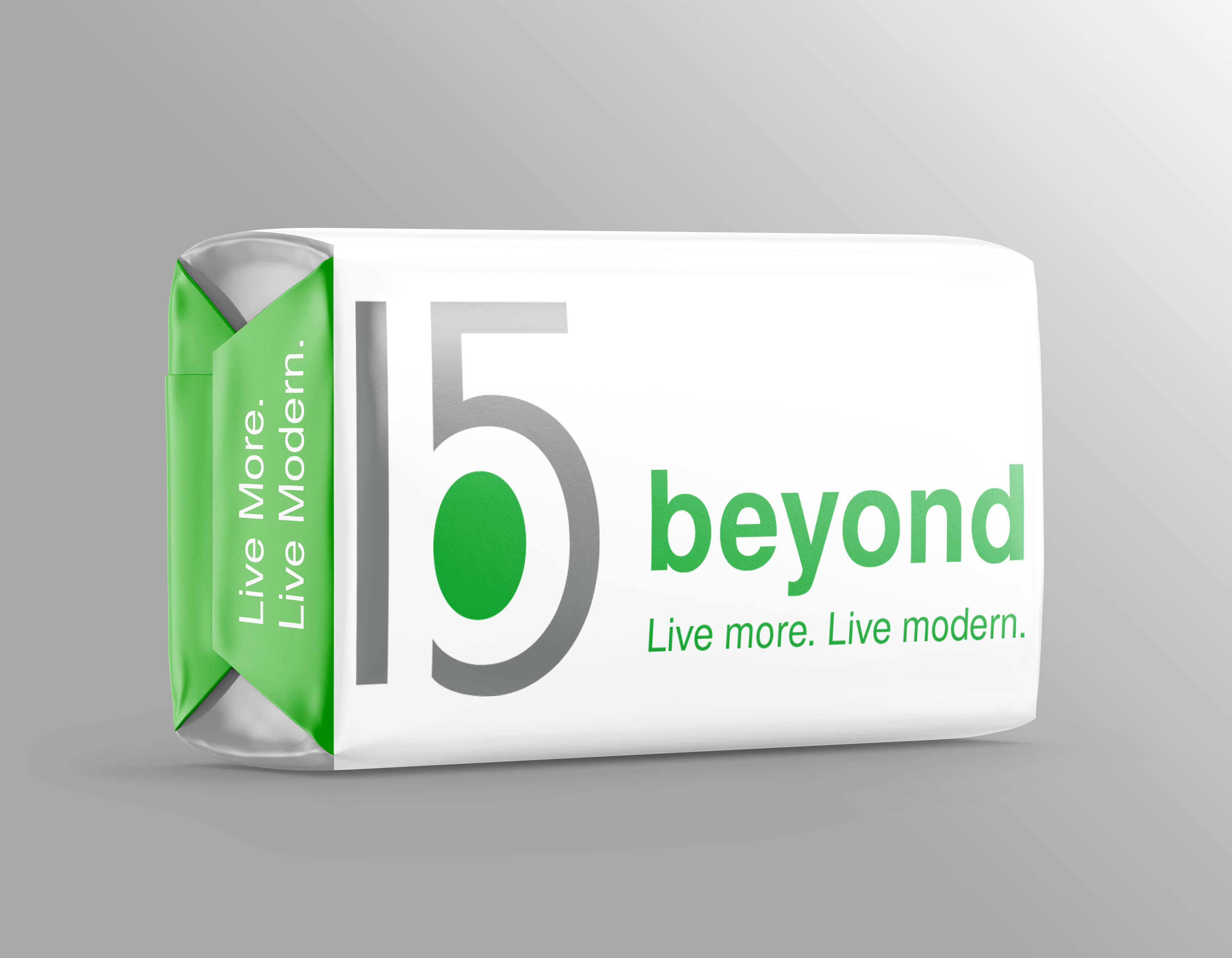
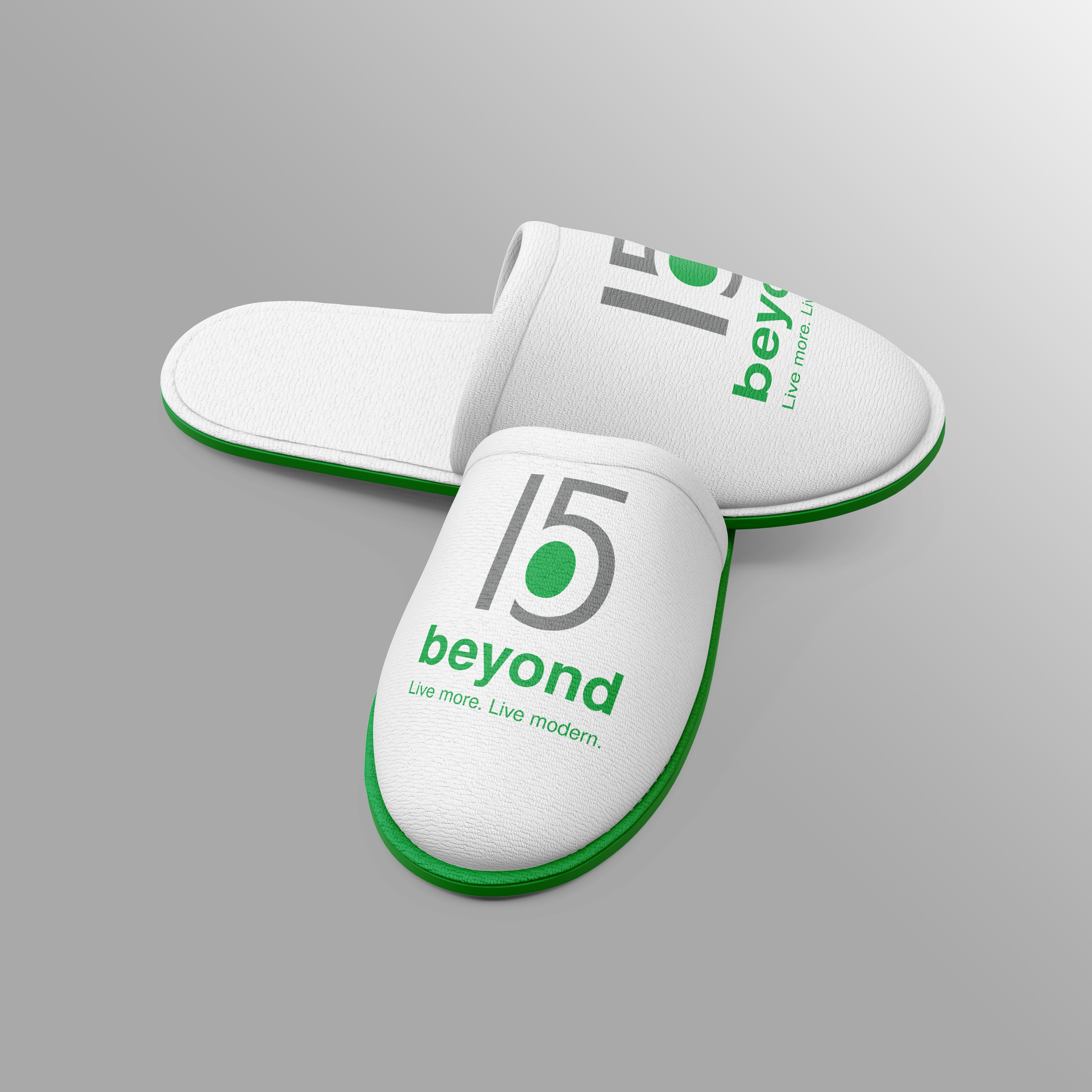
Beyond15 takes luxury living a step further with welcome gifts. Each new tenant upon walking into their new home is greeted with these hotel-reminiscent items, including a door hanger, comfy slippers, and a complimentary beyond15 soap.
The Website
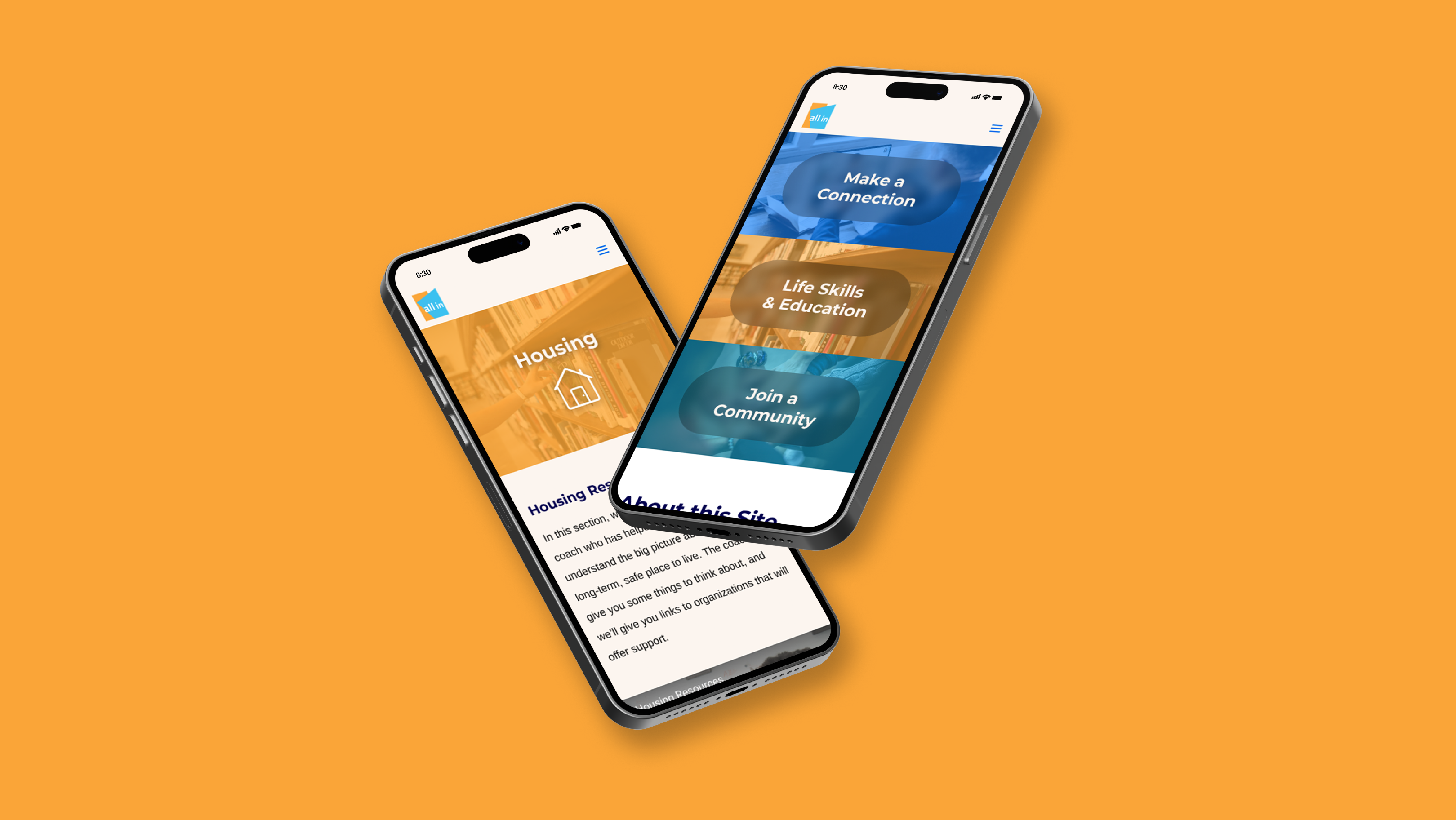
beyond15's website is responsive and can be viewed on both desktop and mobile devices. The website design is visually stunning, easy to navigate, and provides visitors with all the information they need to make an informed decision about living in the complex. By creating a strong online presence, the complex can attract the right residents and build a loyal community. Feel free to scroll through the mockups!
Promotional Graphics
In terms of marketing, beyond15 has its own Facebook and Instagram profiles for anyone interested in any updates for the apartment complex, along with email blasts and promotional graphics to help attract potential future residents.
Home page promo on header
Process
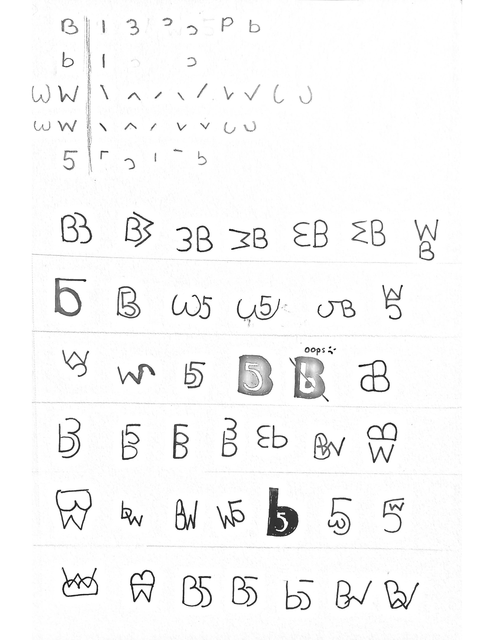
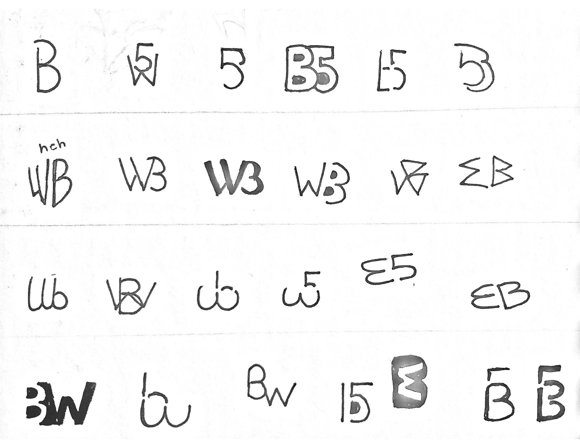
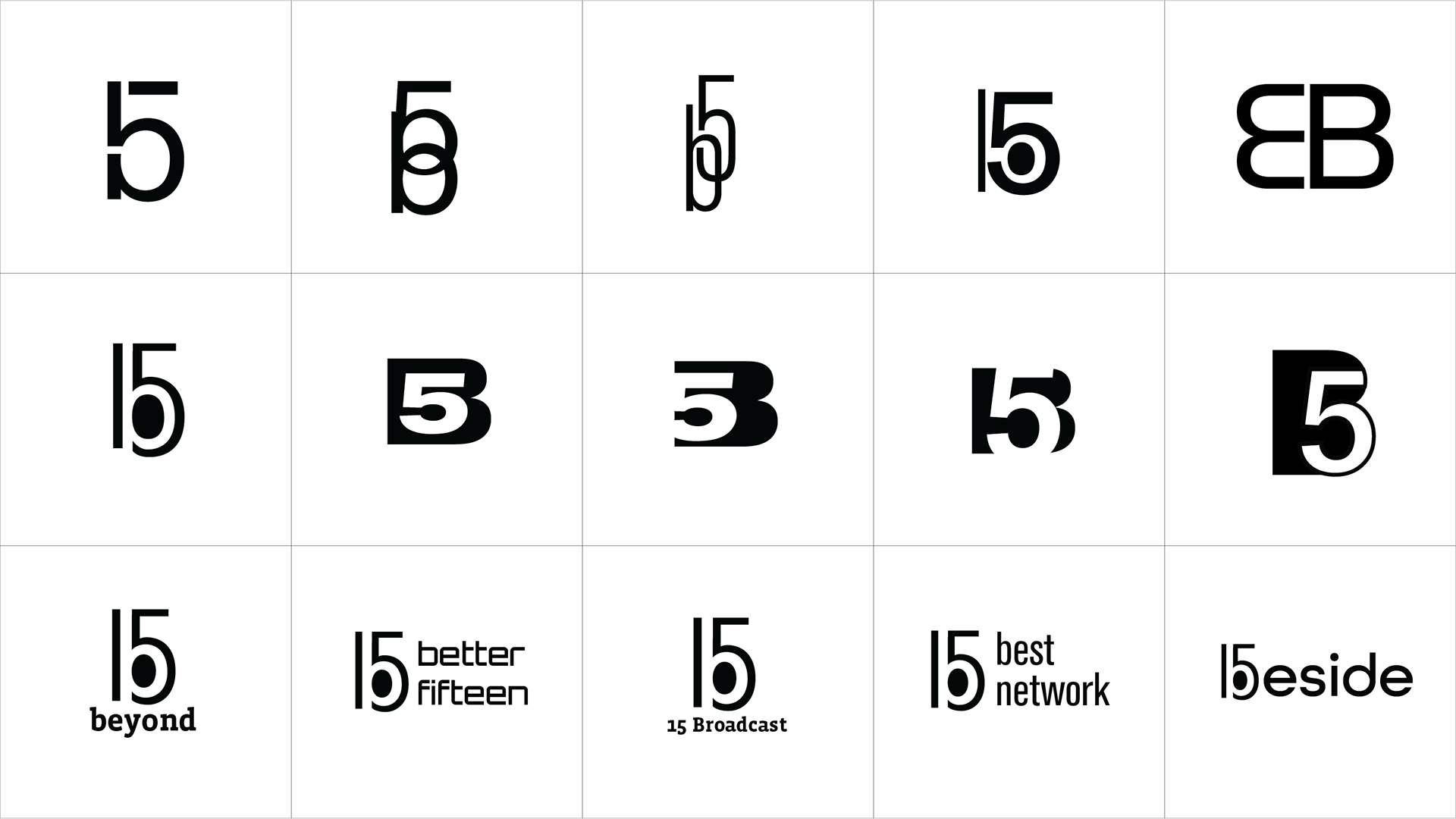
The project started with the design of the logo, where I was given the random combination of the letters "b" and "w" as well as the number "5." However, we can only pair two of those together, not all three. My approach involved breaking down the letters and the number into basic parts. Through a strategic combination, the numeral 5 transformed into 15 as I observed that the negative space within "15" intriguingly resembled a lowercase "b." This evolution in the design process highlights the thoughtful exploration of form and negative space to create a unique and cohesive logo.
Initial motto testing
Wireframes
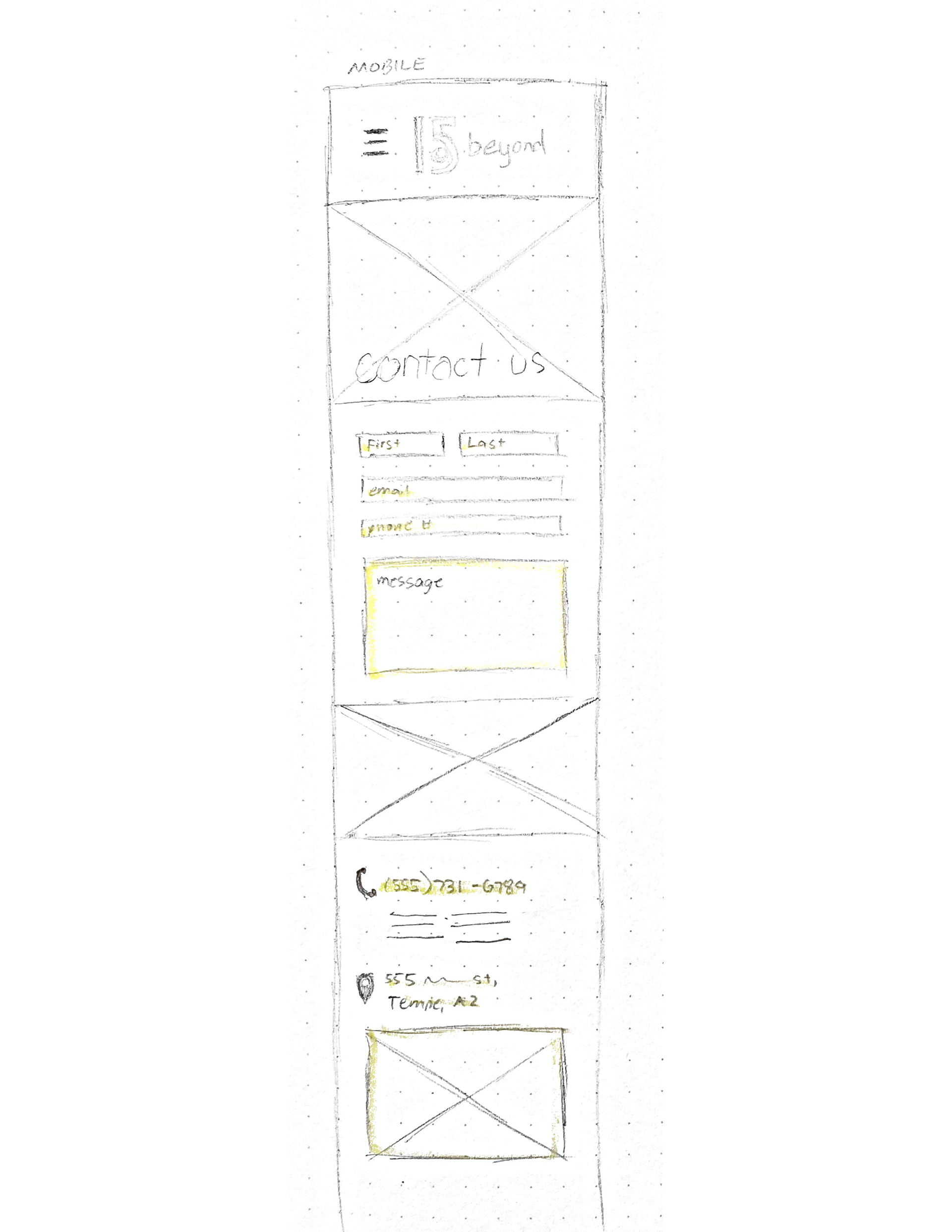
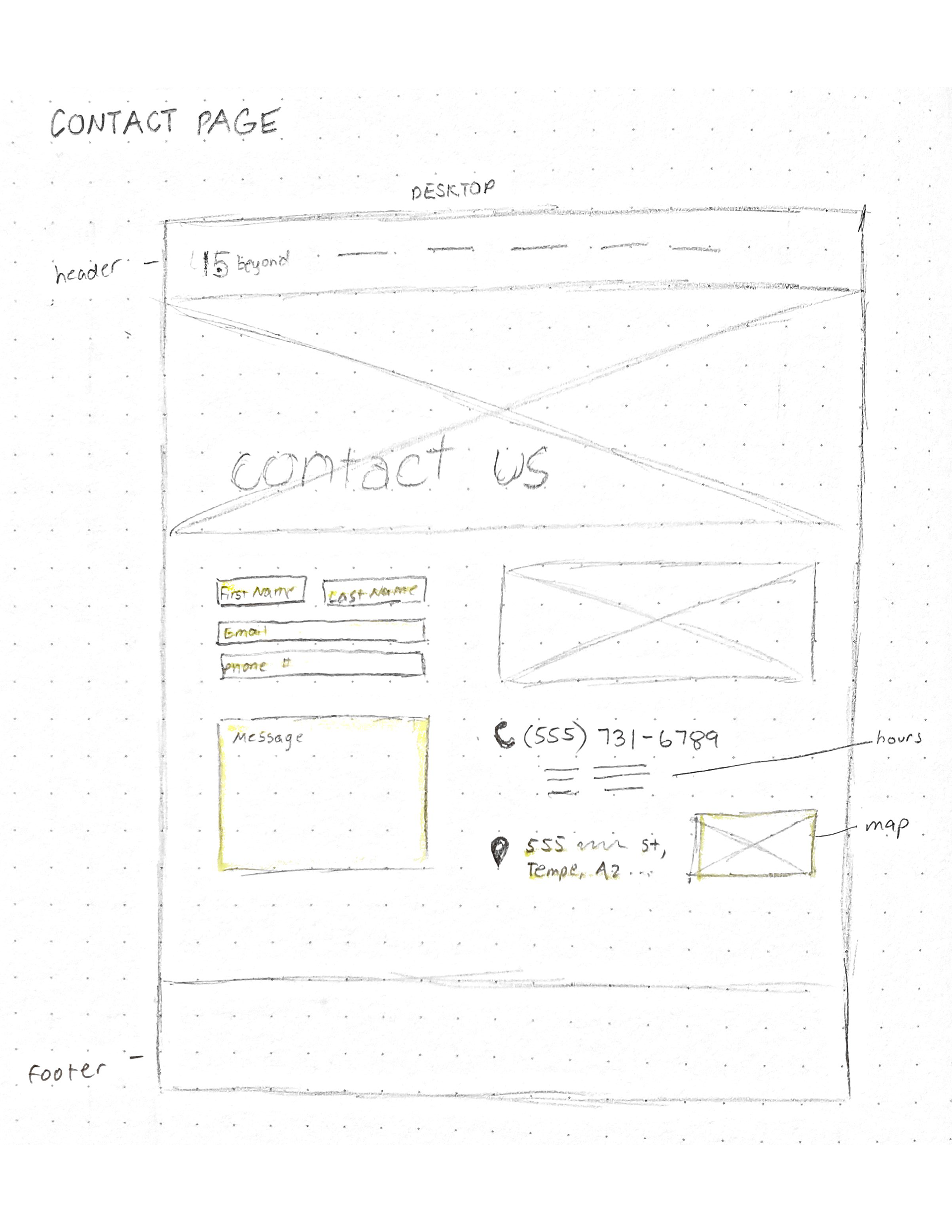
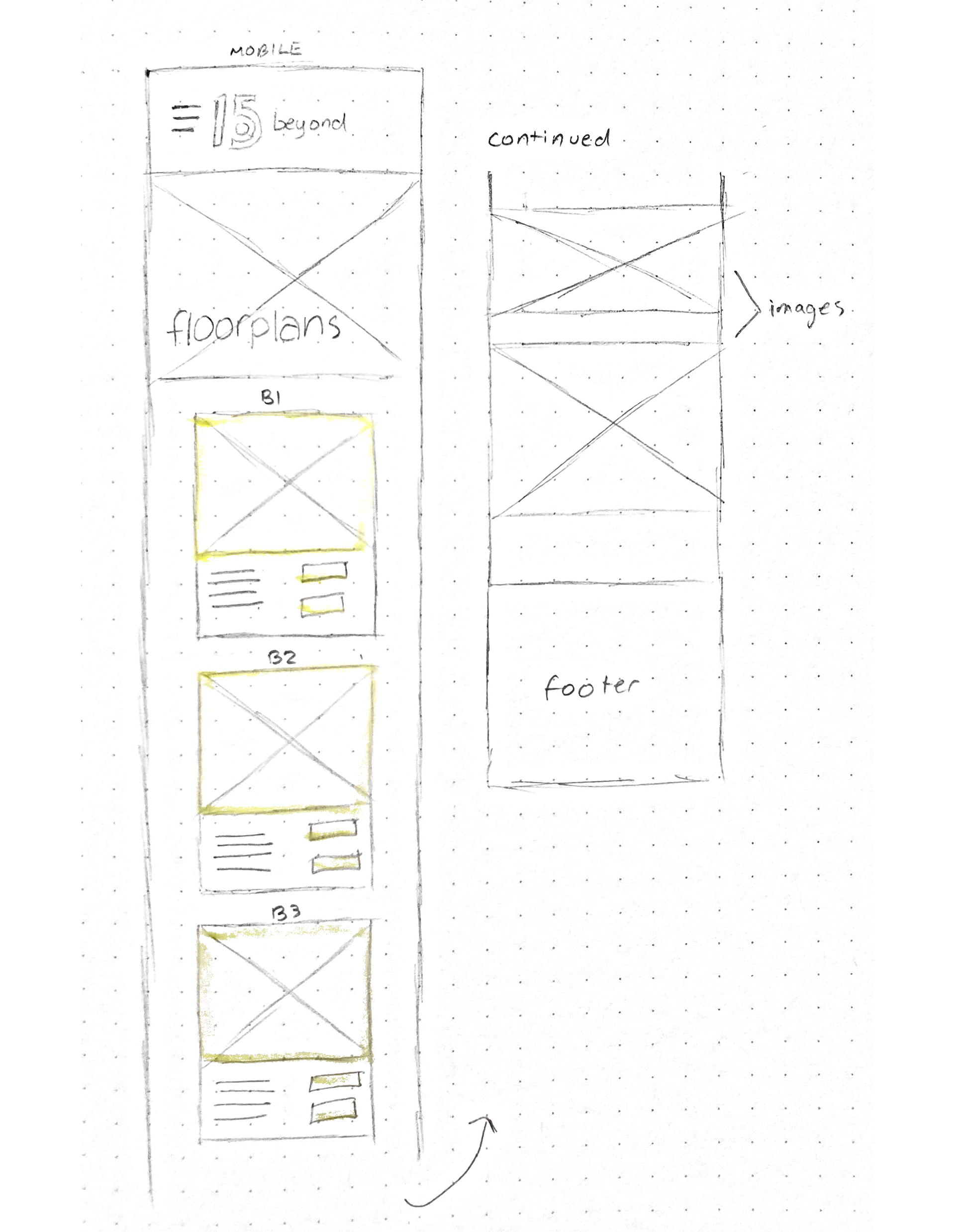
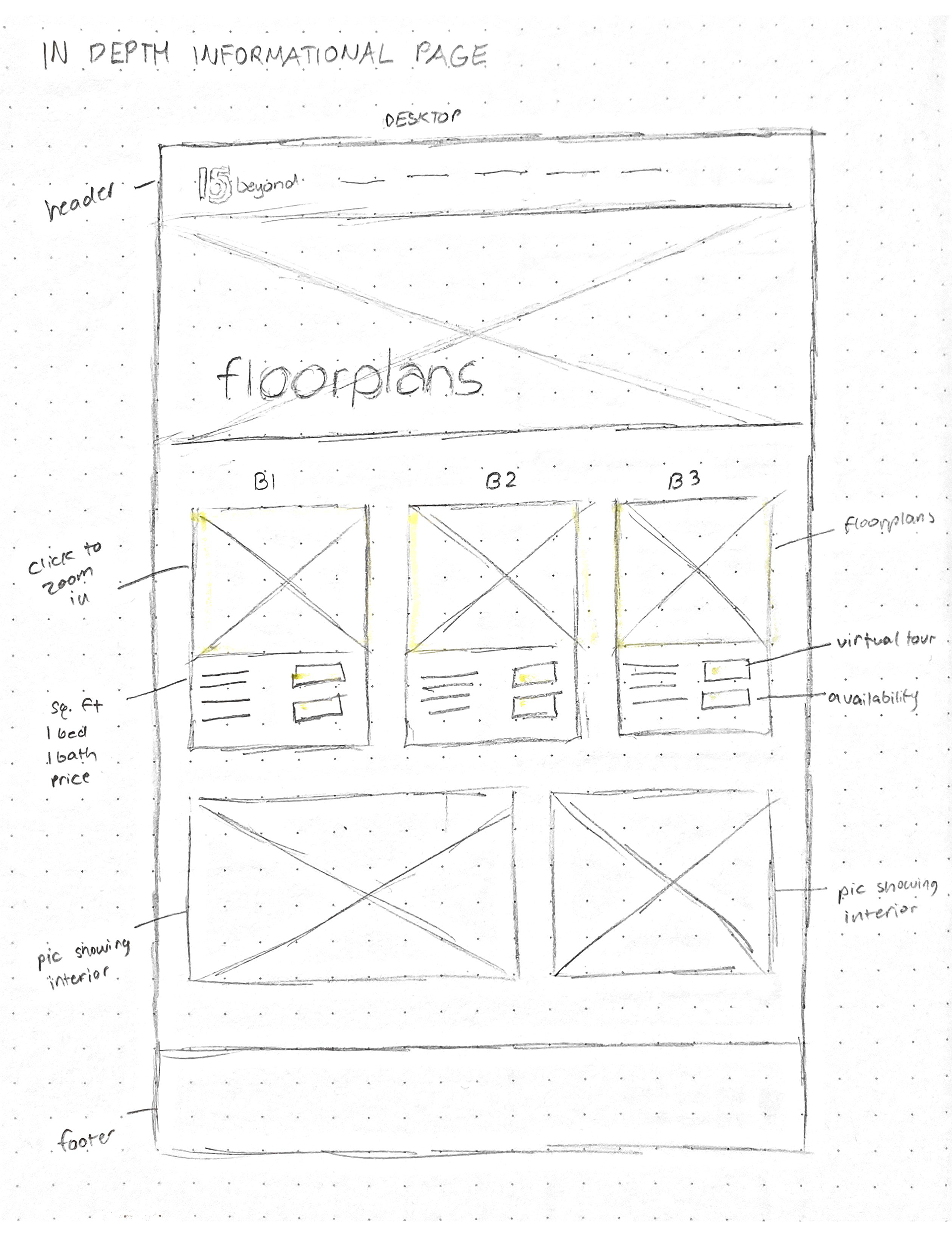
When sketching out wireframes, I began with designing for mobile views first to visualize what can be seen on the smallest display. Then, keeping in mind basic HTML and responsive web design, I sketched out potential wireframes for desktop views.
Storyboarding
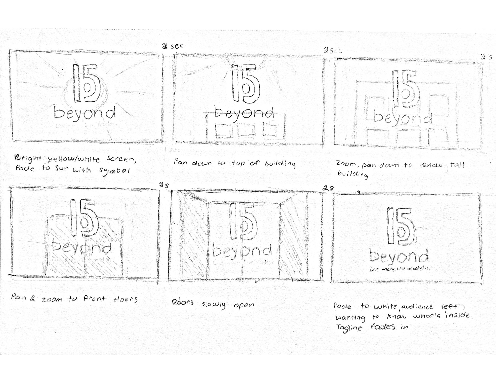
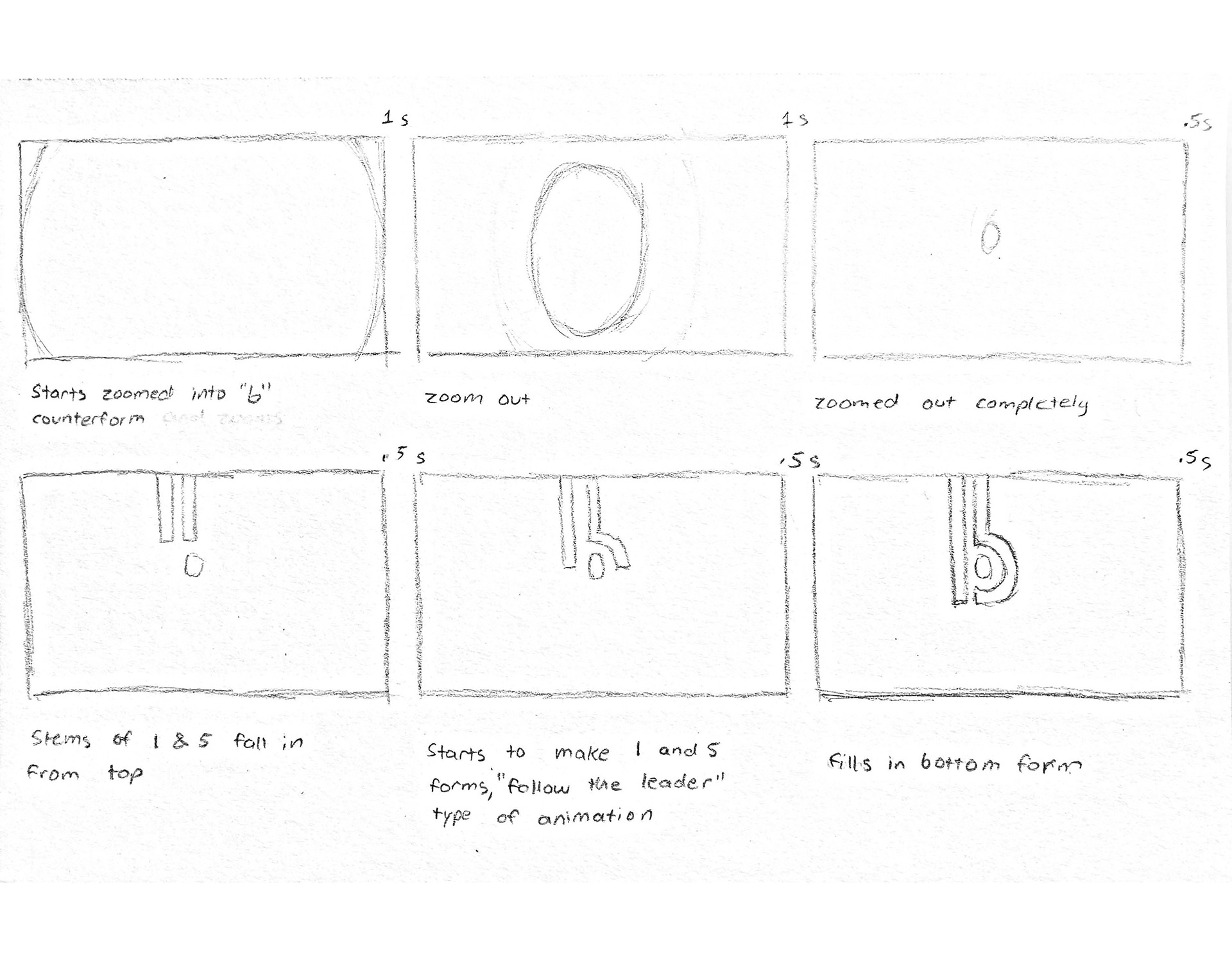
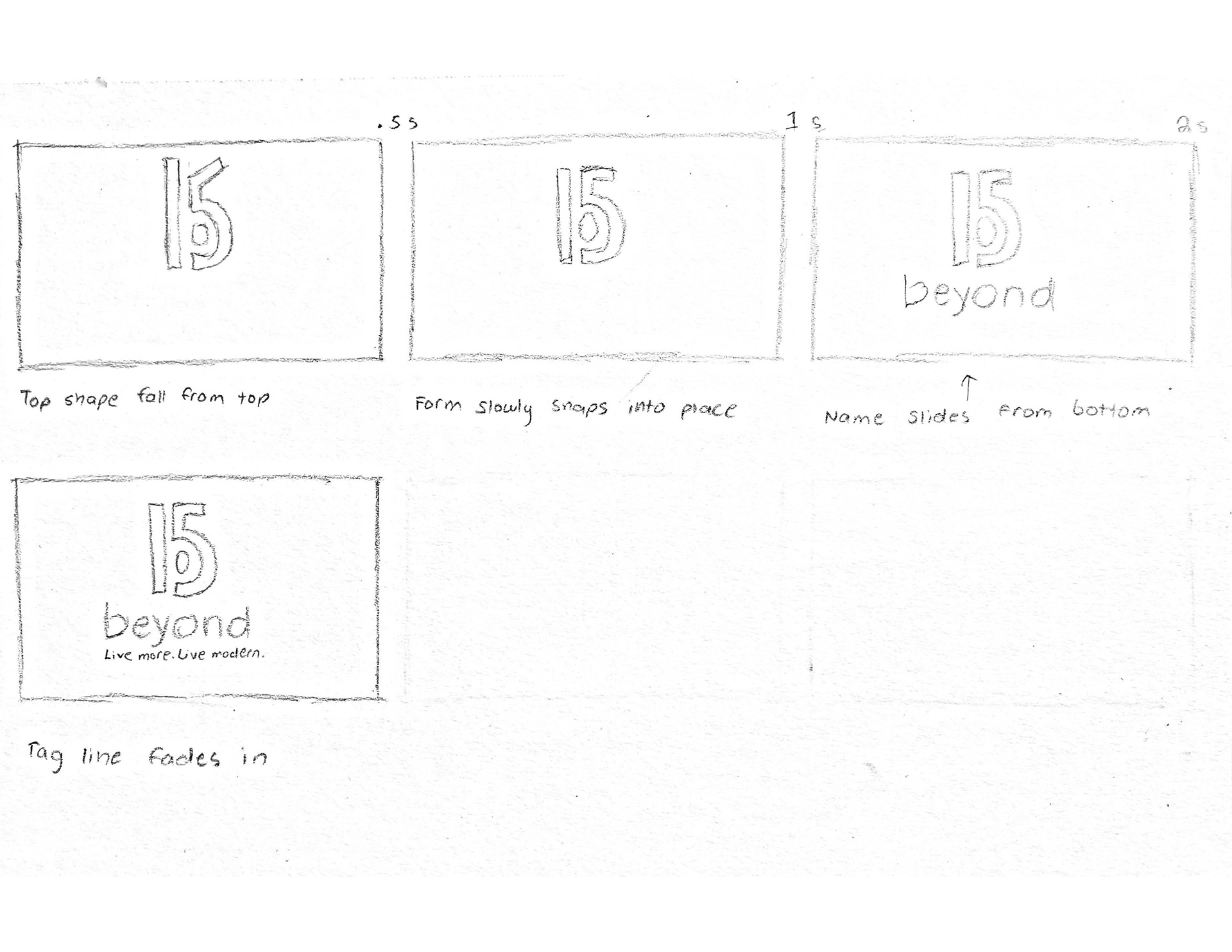
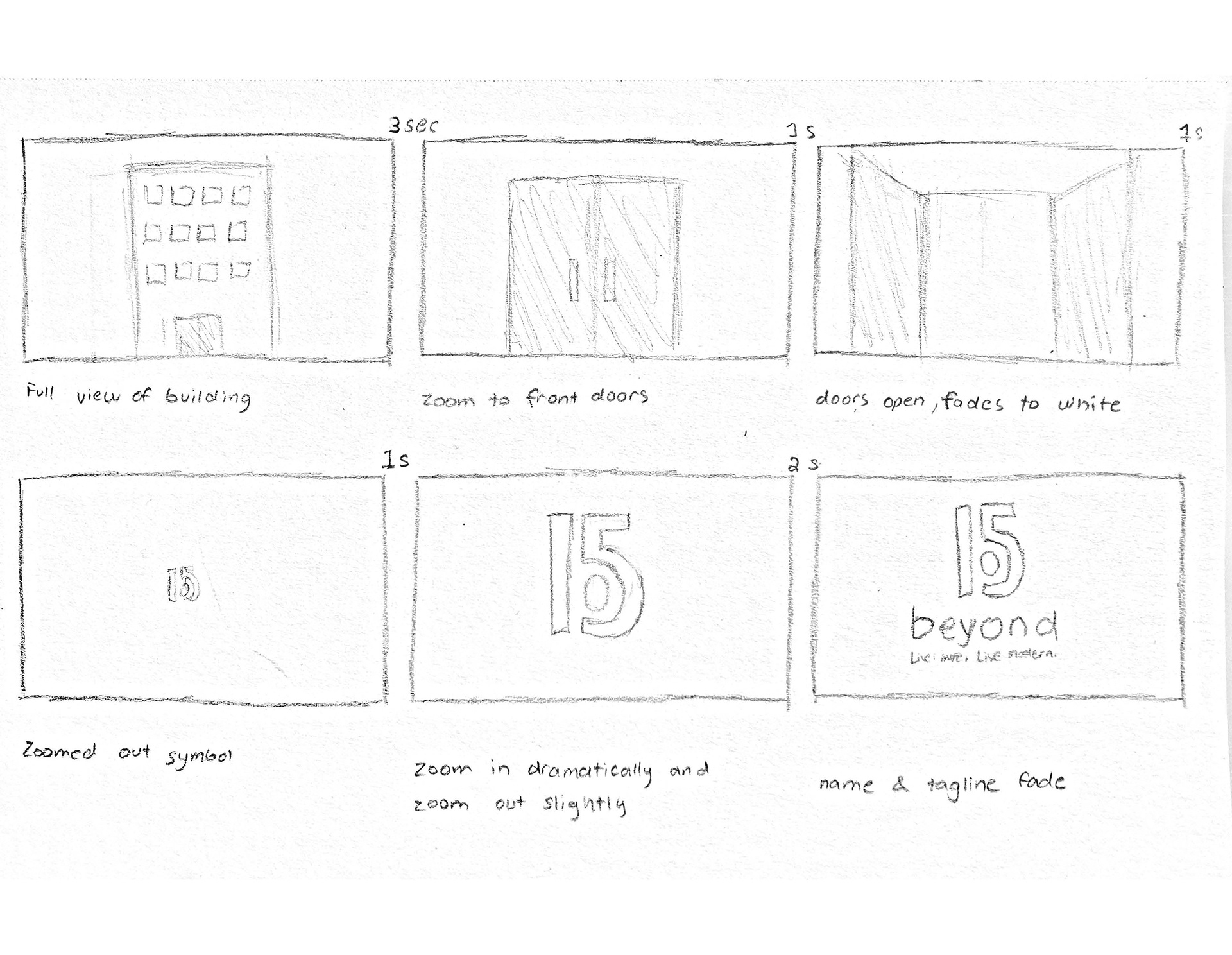
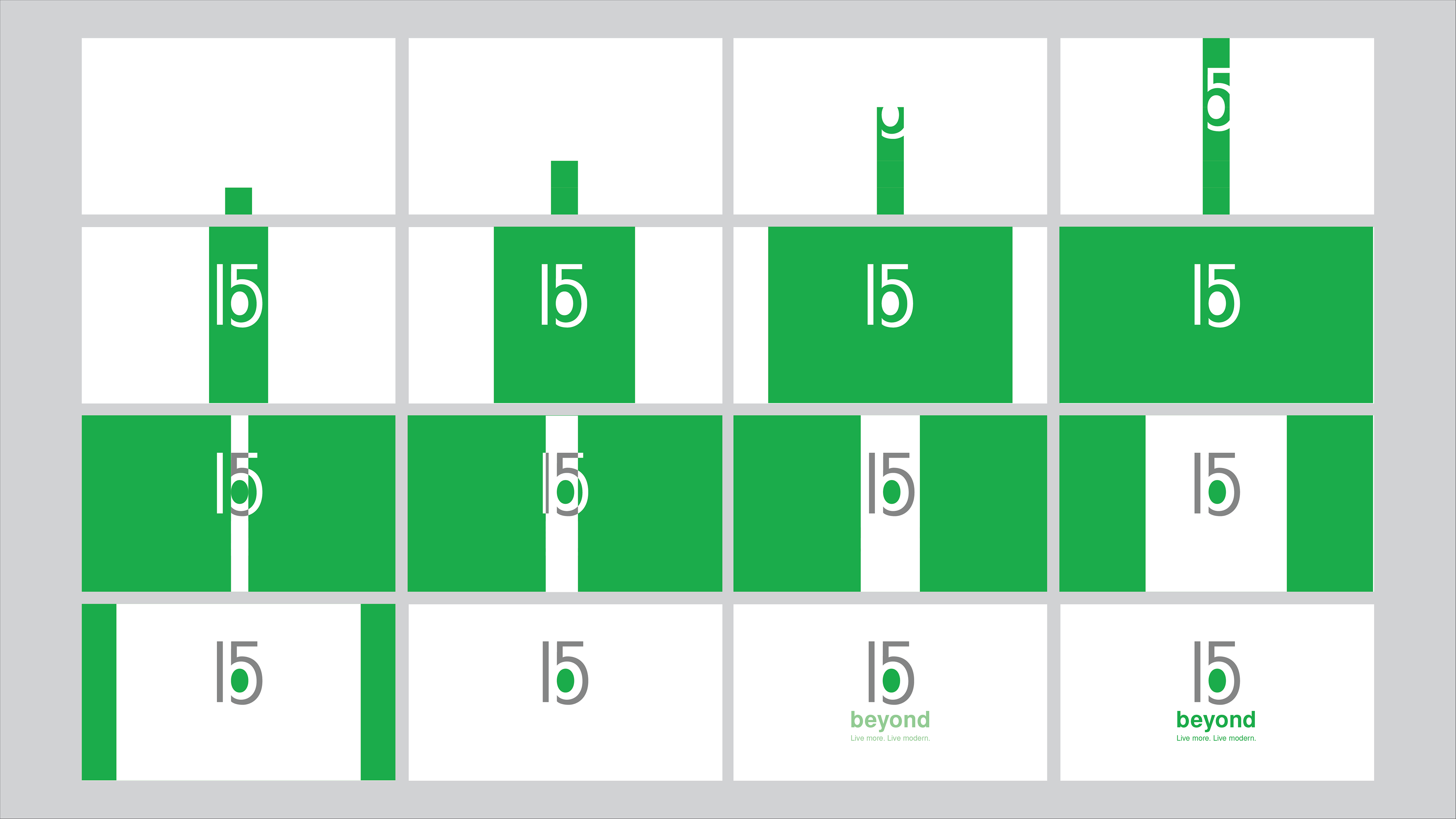
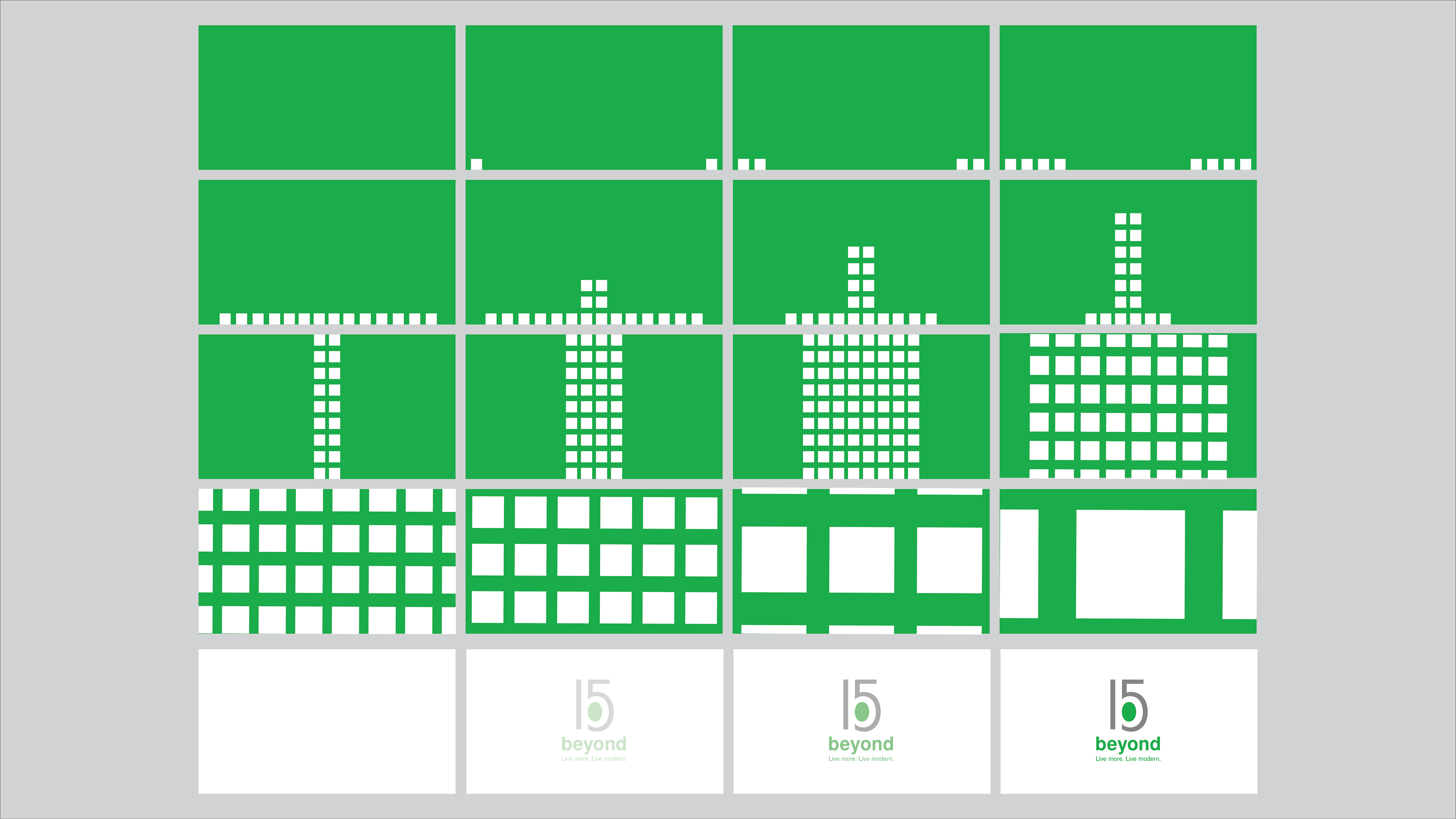
To accompany the symbol, I designed an animation (video on top of page) to convey the logo's feel of a luxury modern apartment complex. I started with sketching storyboards showing a static view of different ideas.
