

Overview
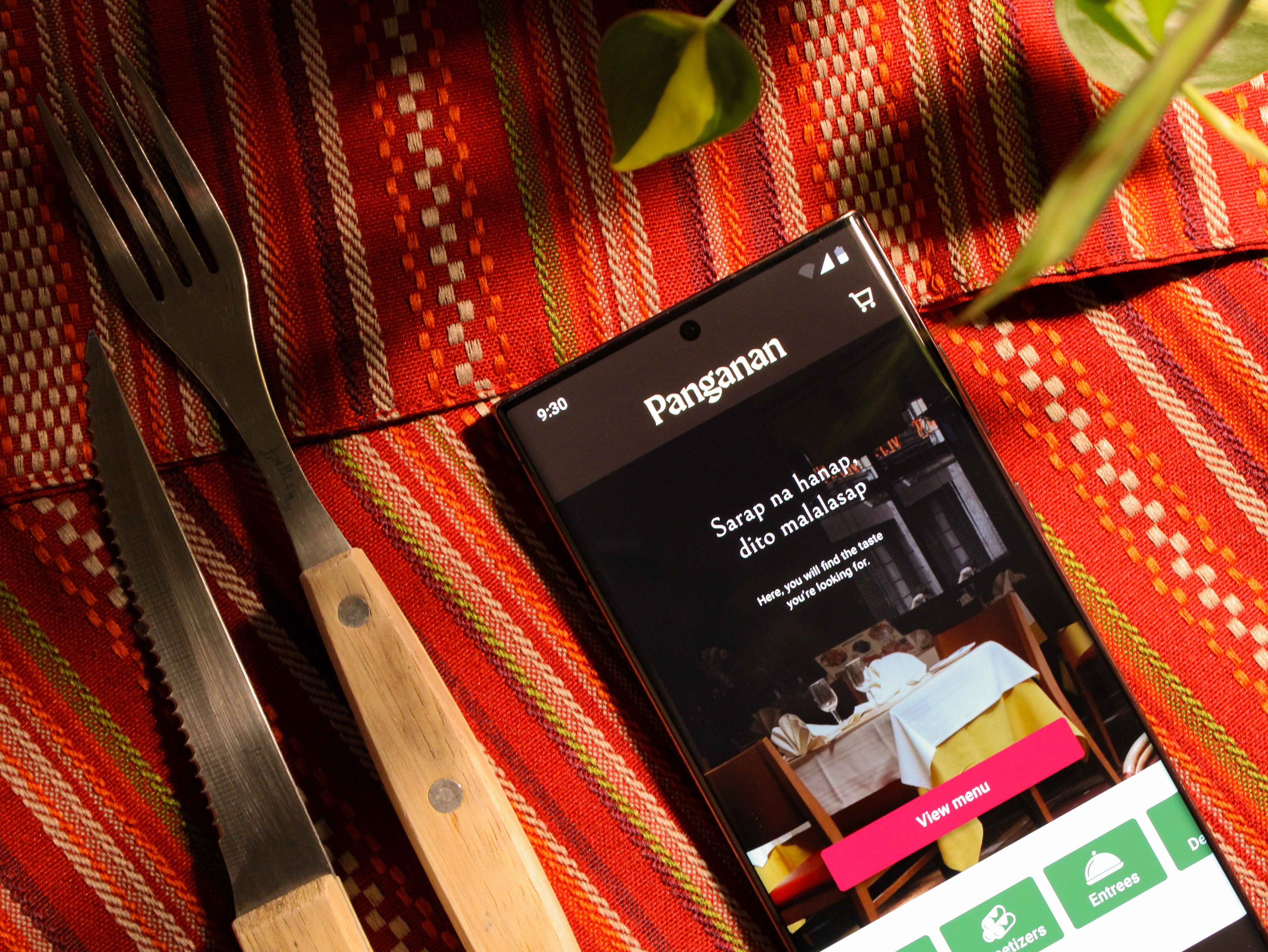
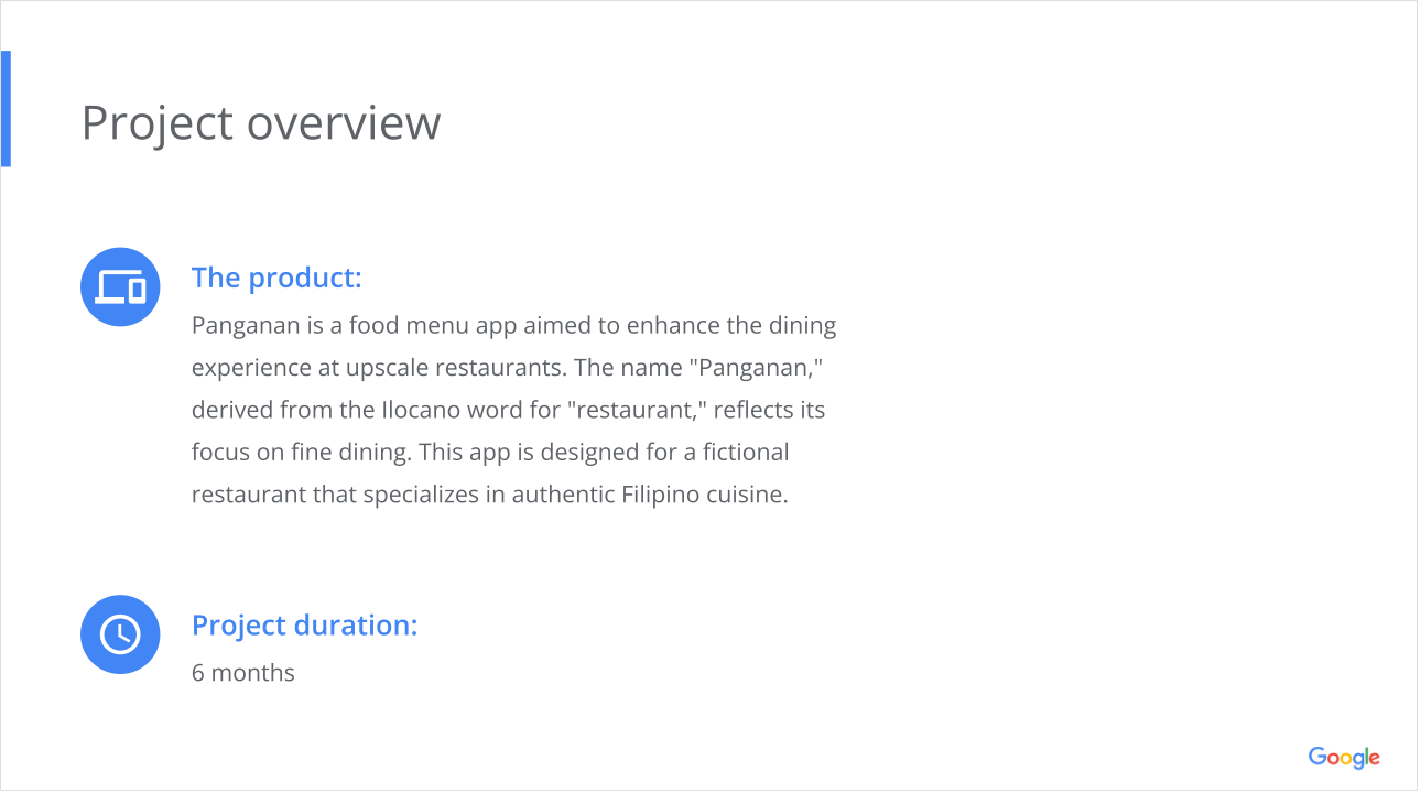
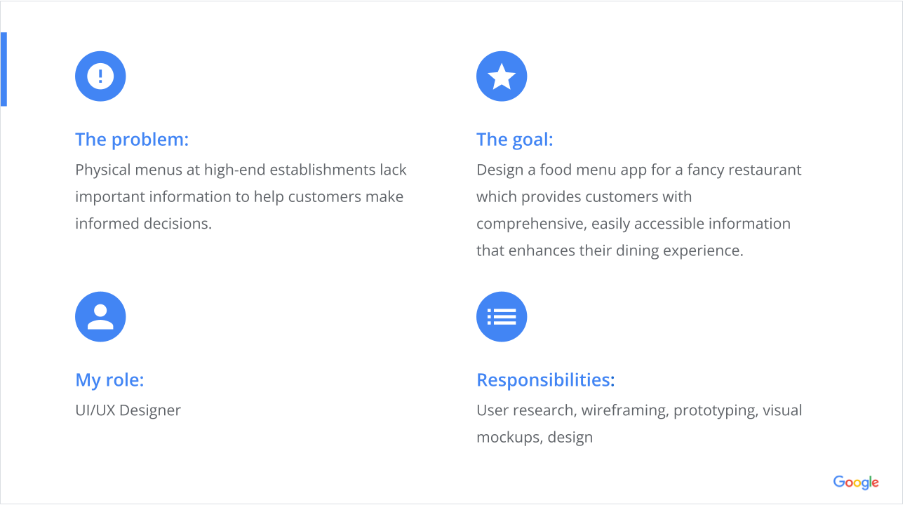
This project was completed as part of the Google UI/UX Certificate. Using a prompt from Sharpen, I was tasked to design a food menu app for a fine dining restaurant. The goal was to explore how such an app could enhance the dining experience and what might motivate customers to choose it over a traditional physical menu.
The final presentation of this project was delivered via Google Slides, showcasing the app's development journey toward achieving the Google UI/UX Certificate. The branding is inspired by Google's design principles.
Understanding the User
User Research
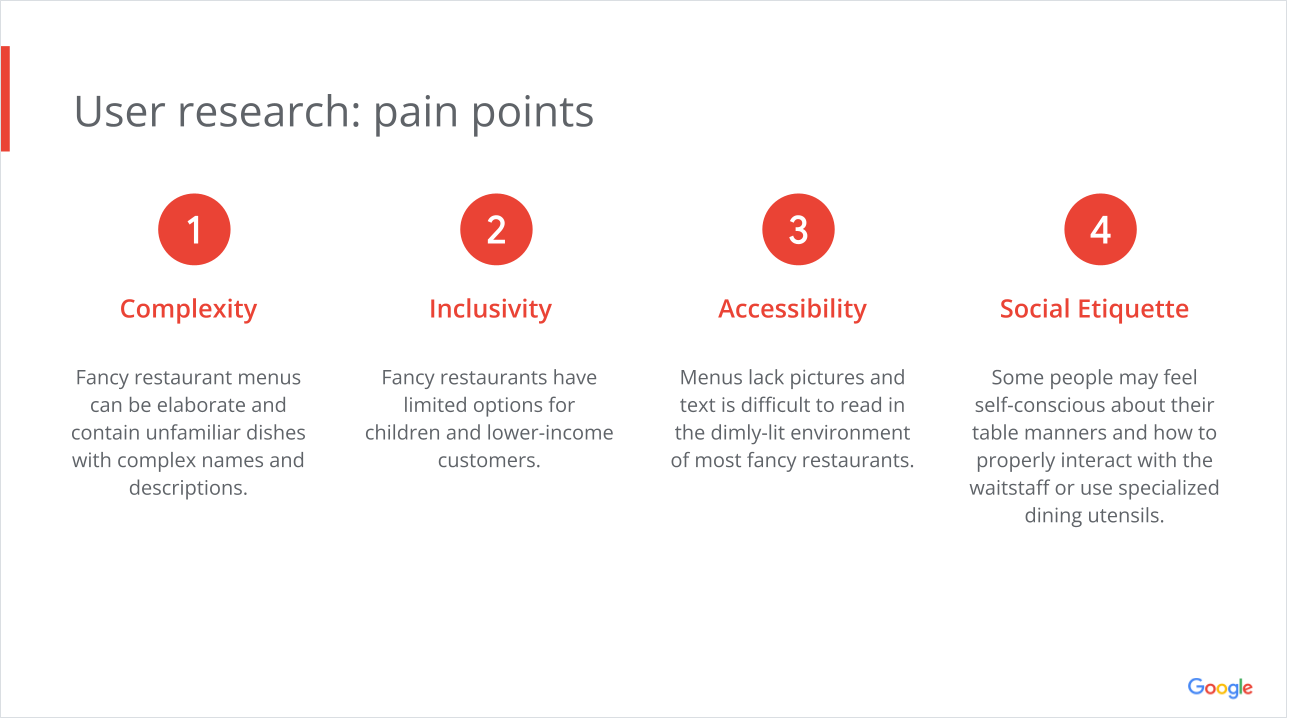
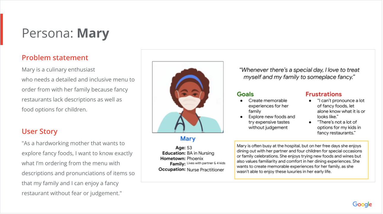
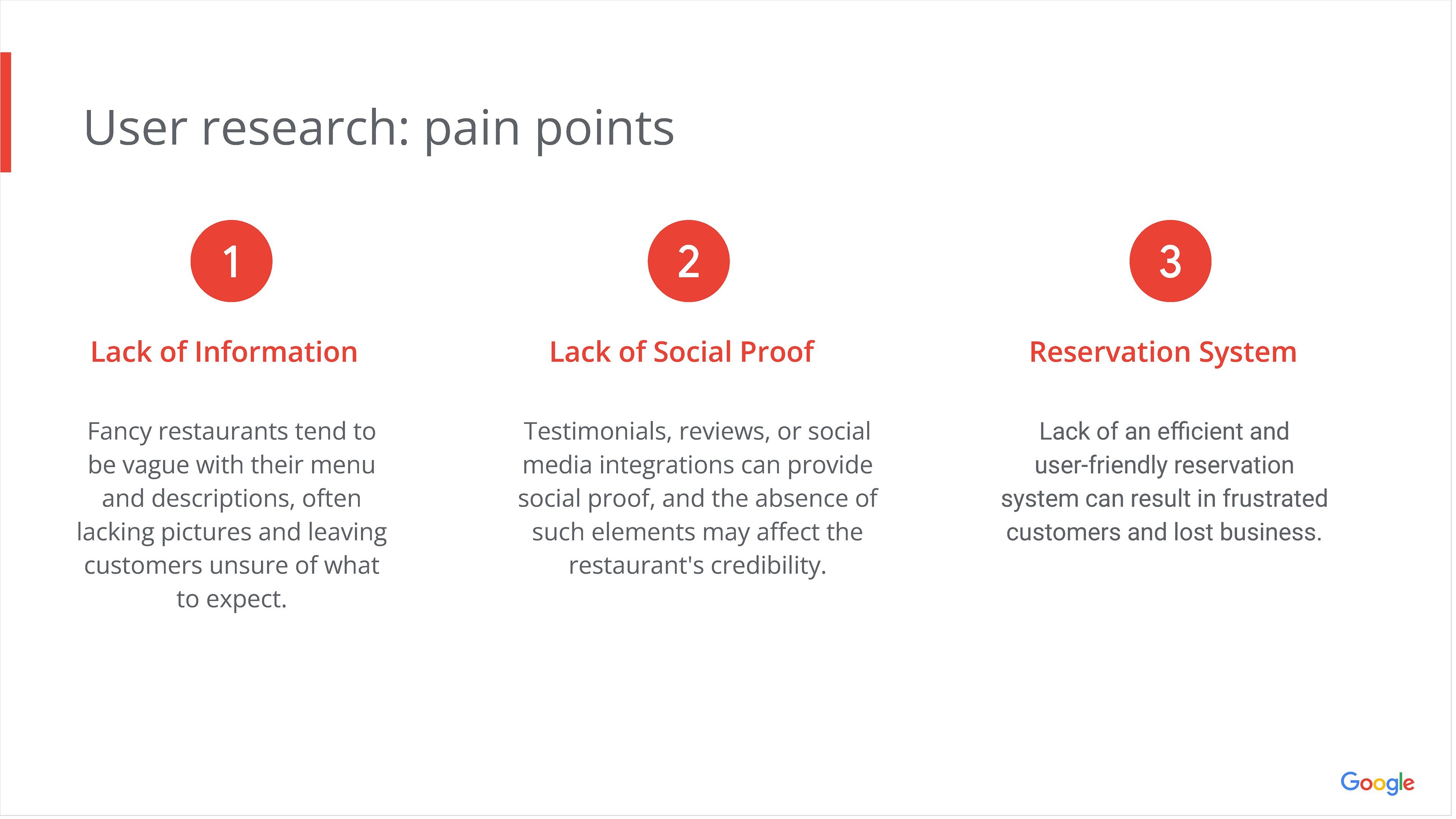
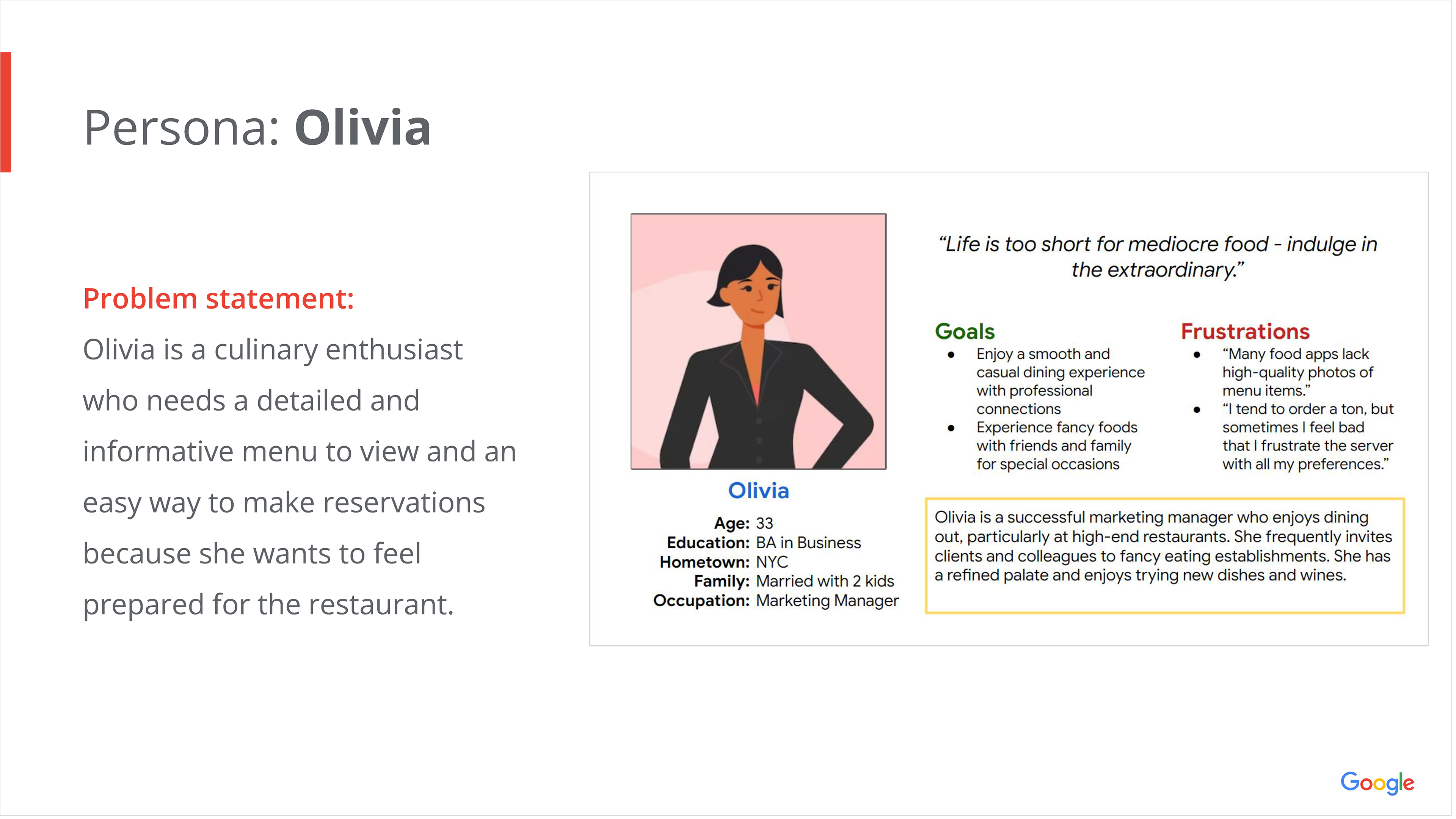
I conducted interviews and research to understand the users I’m designing for and their needs. A primary user group identified through research were adults that dined at fancy restaurants for special events or celebrations.
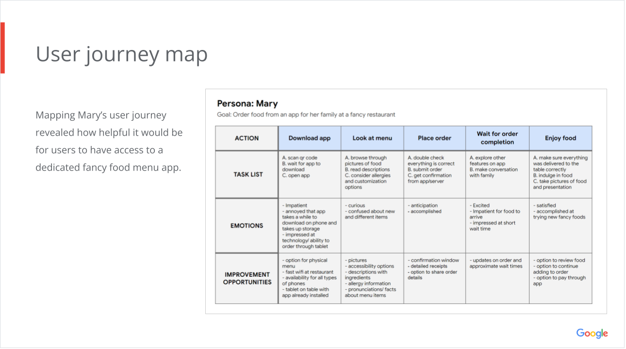
This user group confirmed initial assumptions about the fancy food restaurant’s customers, but research also revealed that the complexity of the menu was not the only factor limiting users from having a comfortable dining experience. Other user problems included inclusivity, accessibility, and social etiquette expectations.
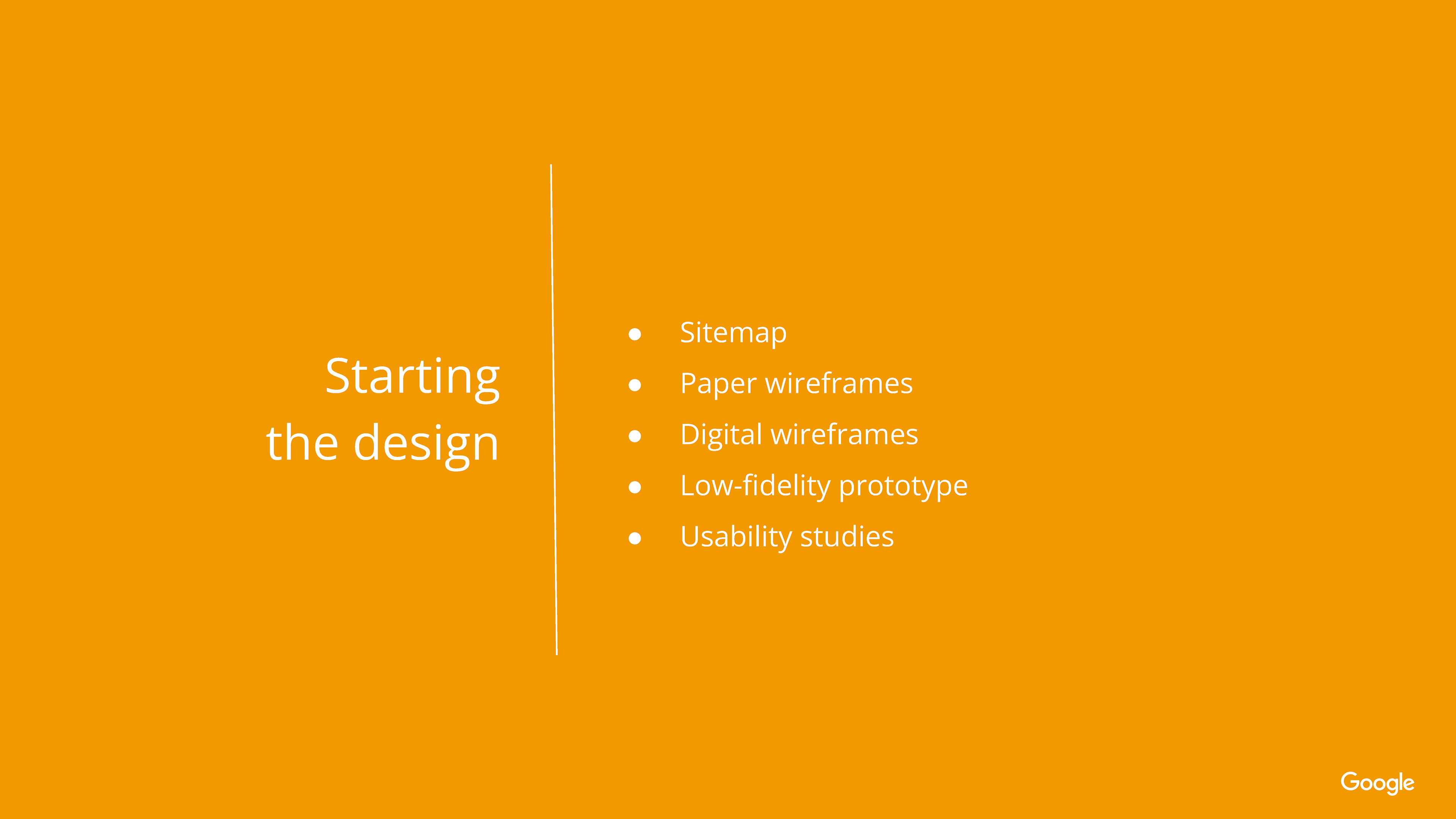
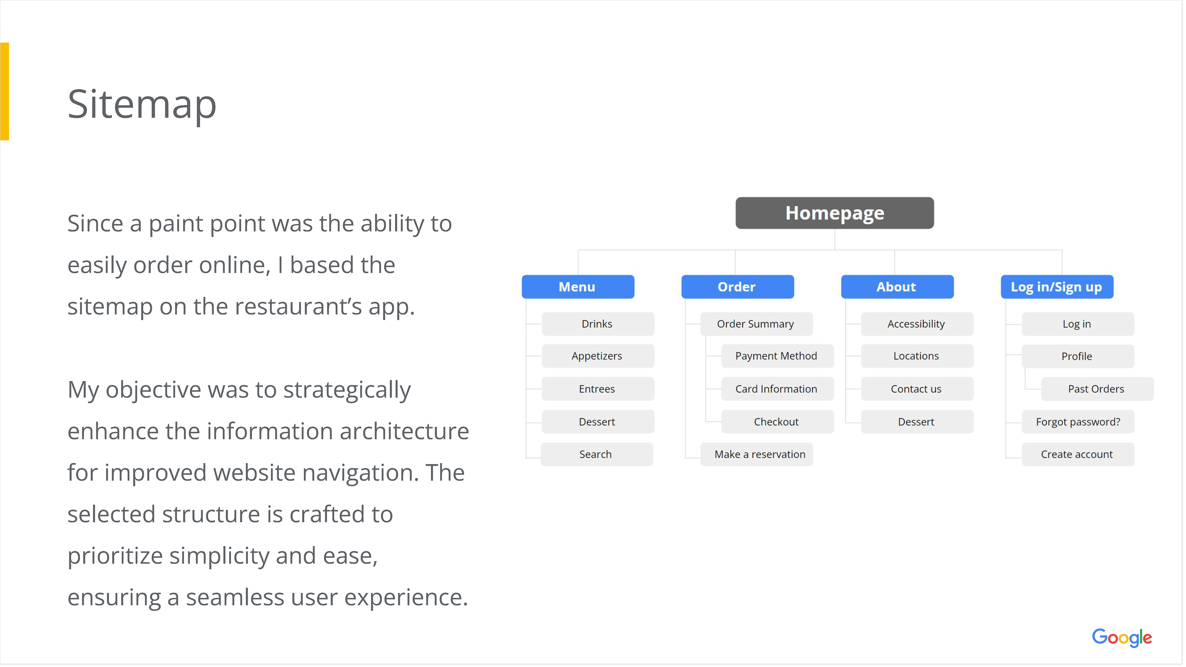
Starting the Design

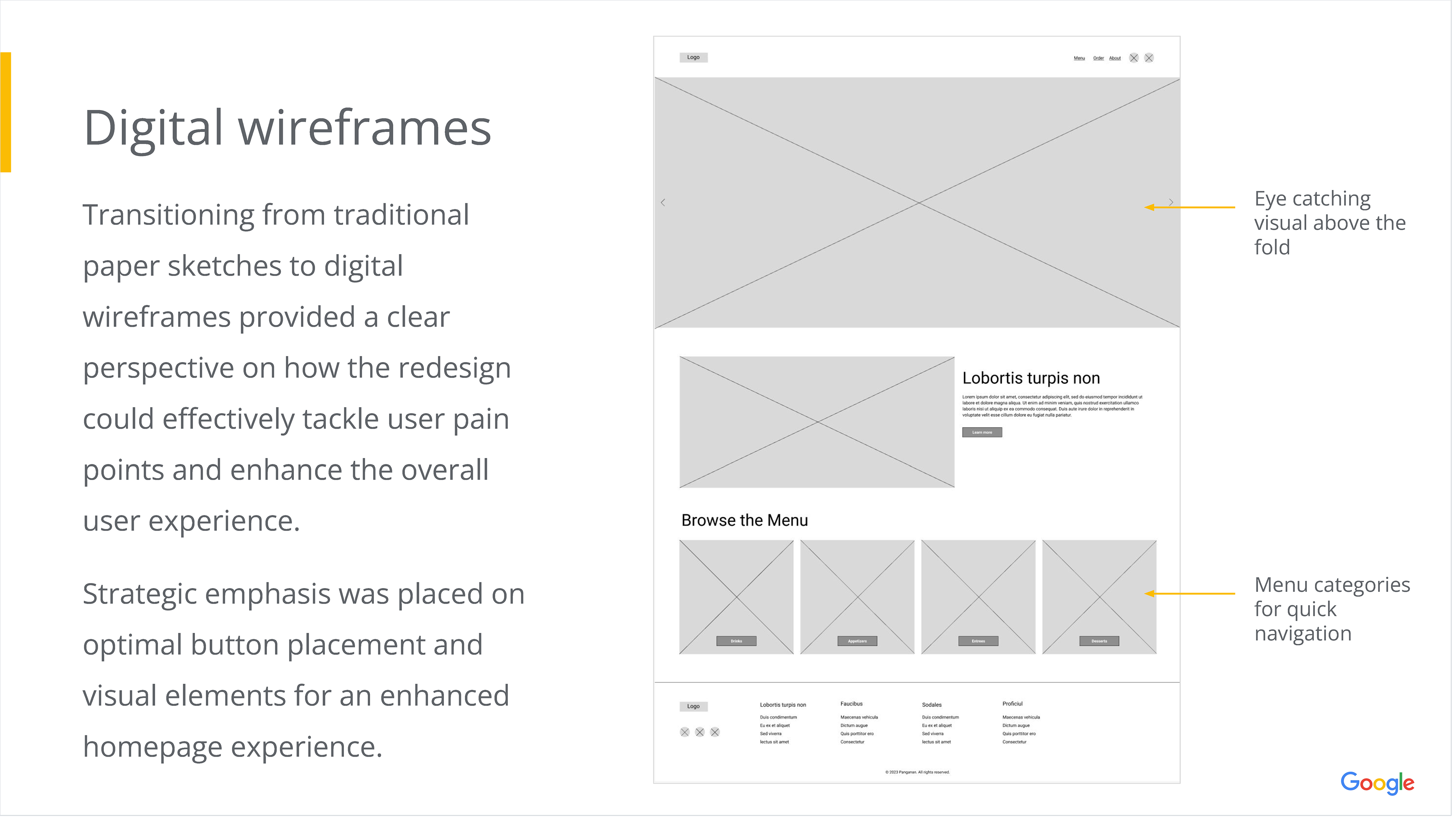
Digital Wireframes
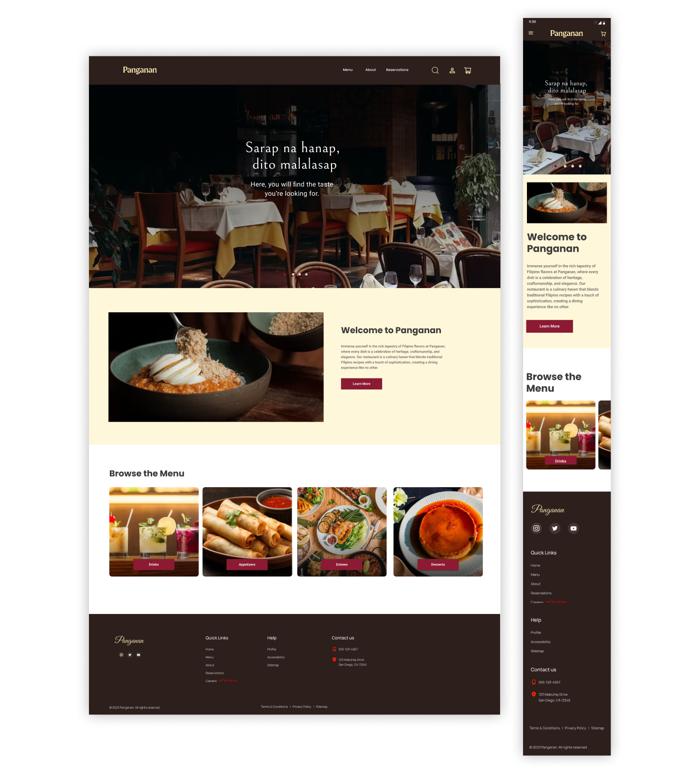
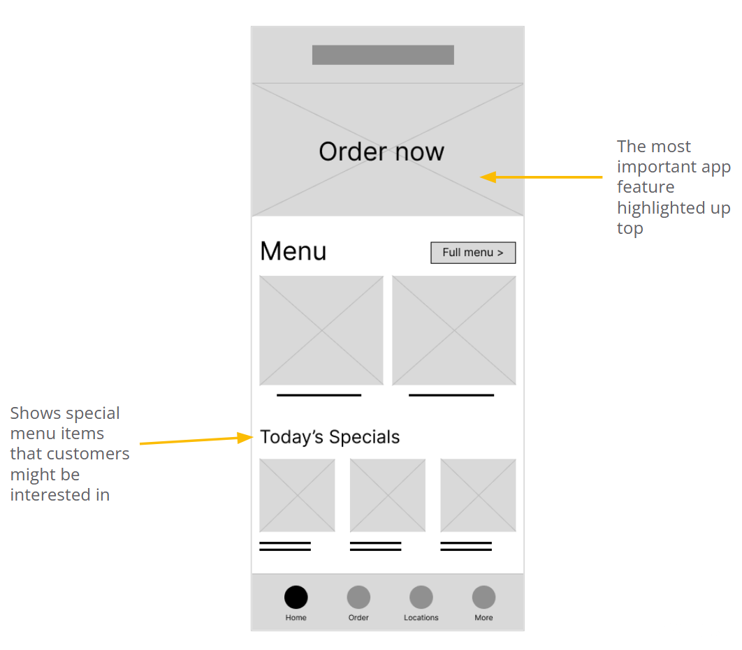
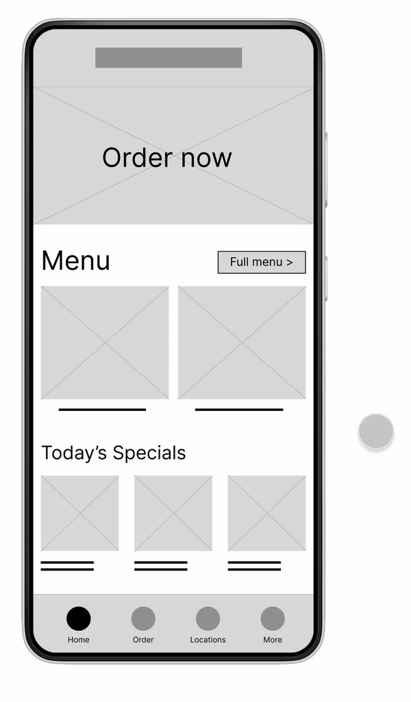
The Homepage digital wireframe was created based on the most useful and repeated features from the paper wireframes.
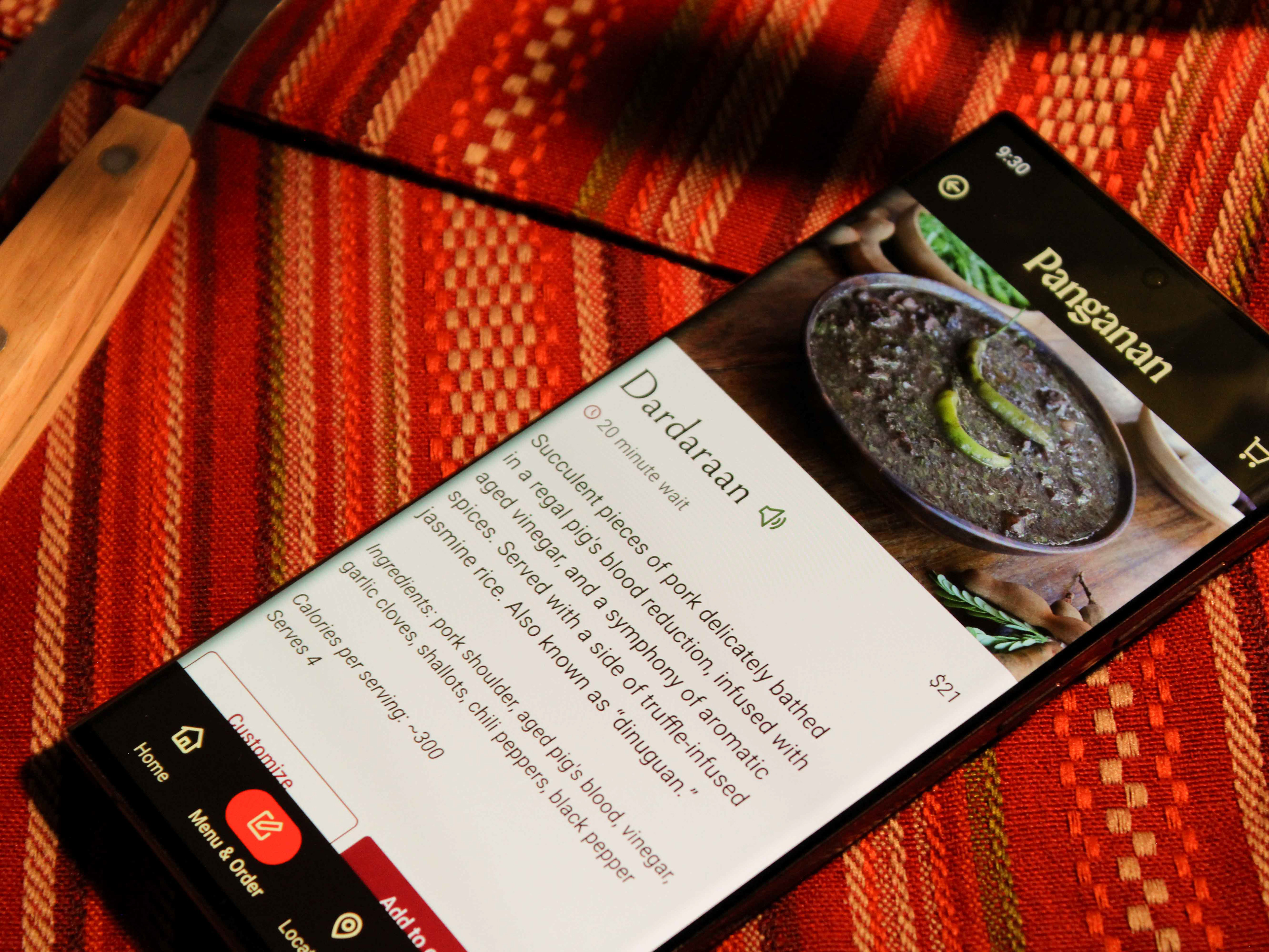
This shows the menu list that can be accessed from tapping “Order now,” “Full menu,” or “Order” on the nav bar.

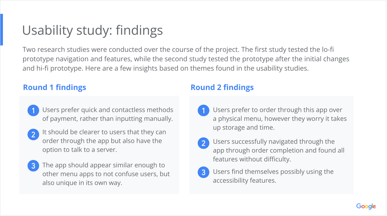
Usability Study
Research Questions
1) What can we learn from the user flow of ordering through the app?
2) Are there parts of the user flow where the user gets stuck?
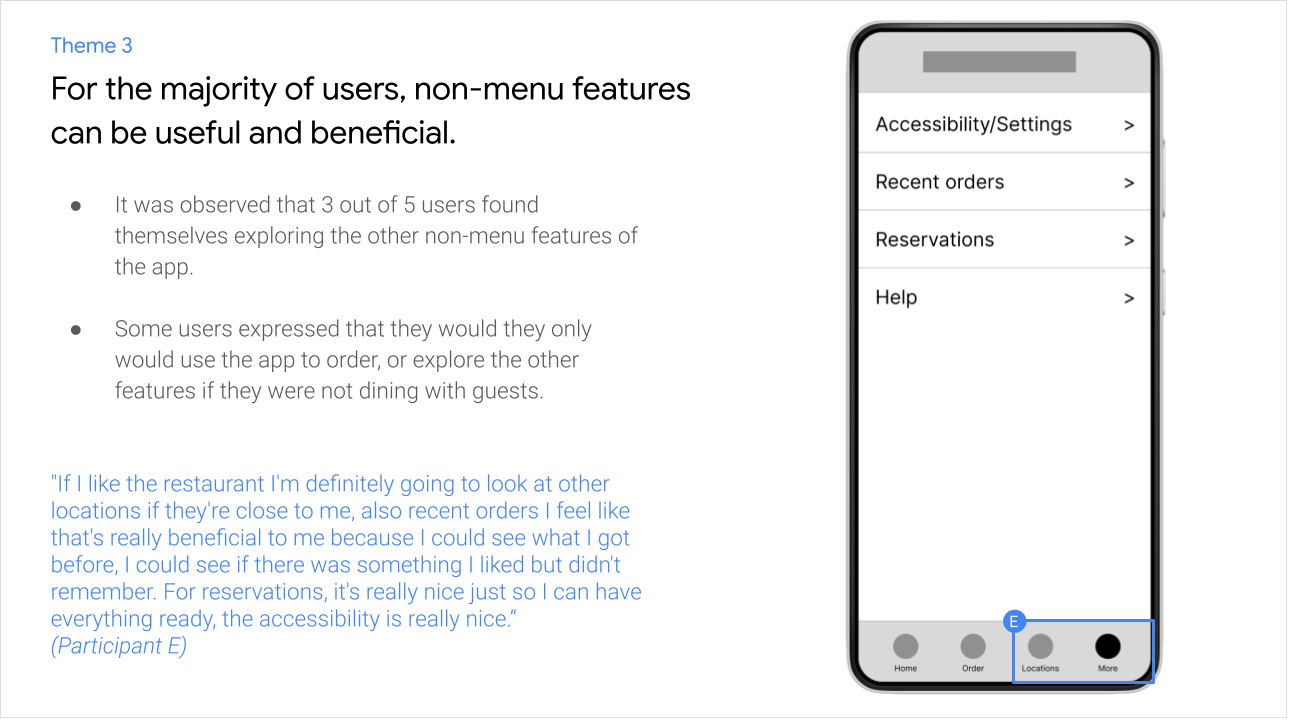
3) Do the users explore the other features of the app and find them valuable?
4) Do the users think the app is easy or difficult to use compared to a physical menu?
Participants
- 5 participants
- 3 males, 2 females
- 2 over 50 years old
- 3 aged 21-24
Methodology
- 10 minutes per participant
- United States, in person and remote
- Moderated usability study
- Users were asked to perform tasks in a low-fidelity prototype and fill out survey
Testing the Prototype
From the home screen, participants were tasked to go through the steps they would take to order an item and confirm their order.
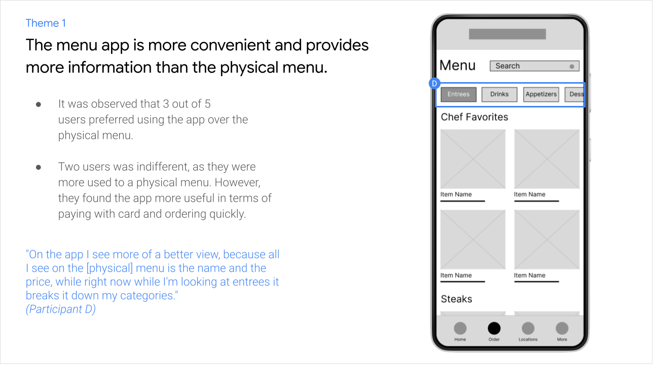
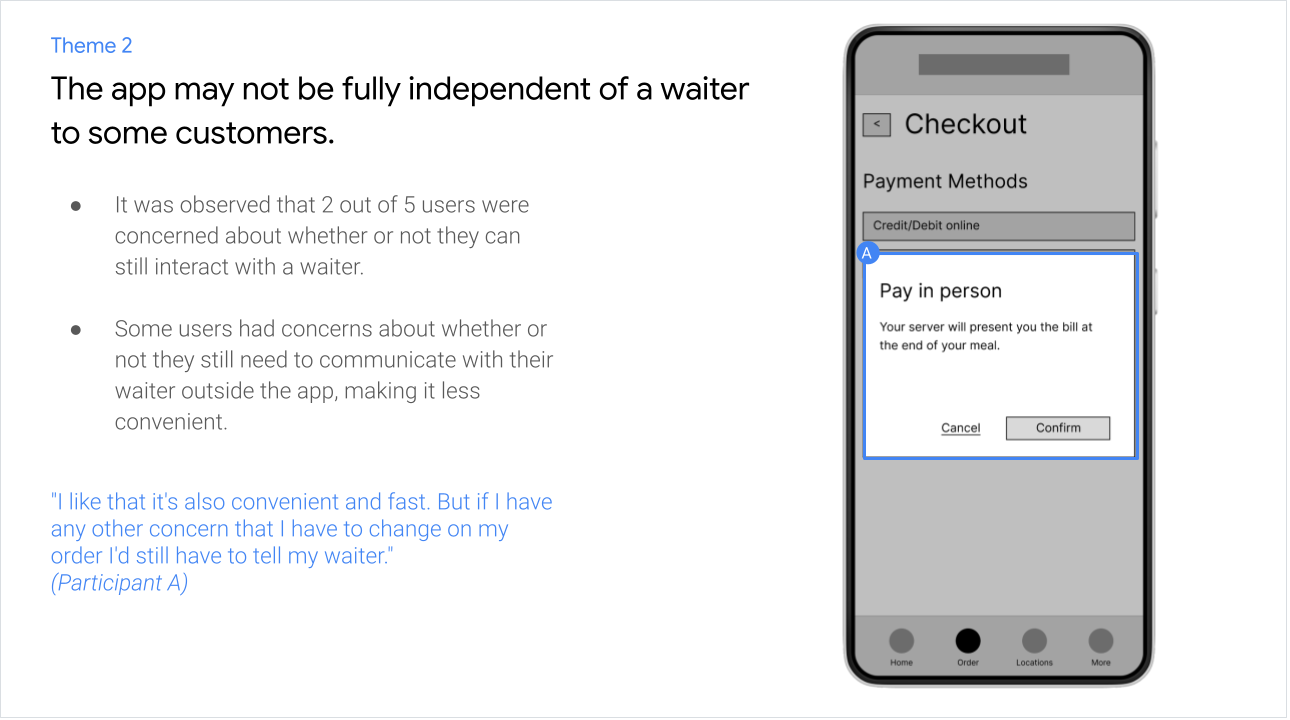
Themes and Insights

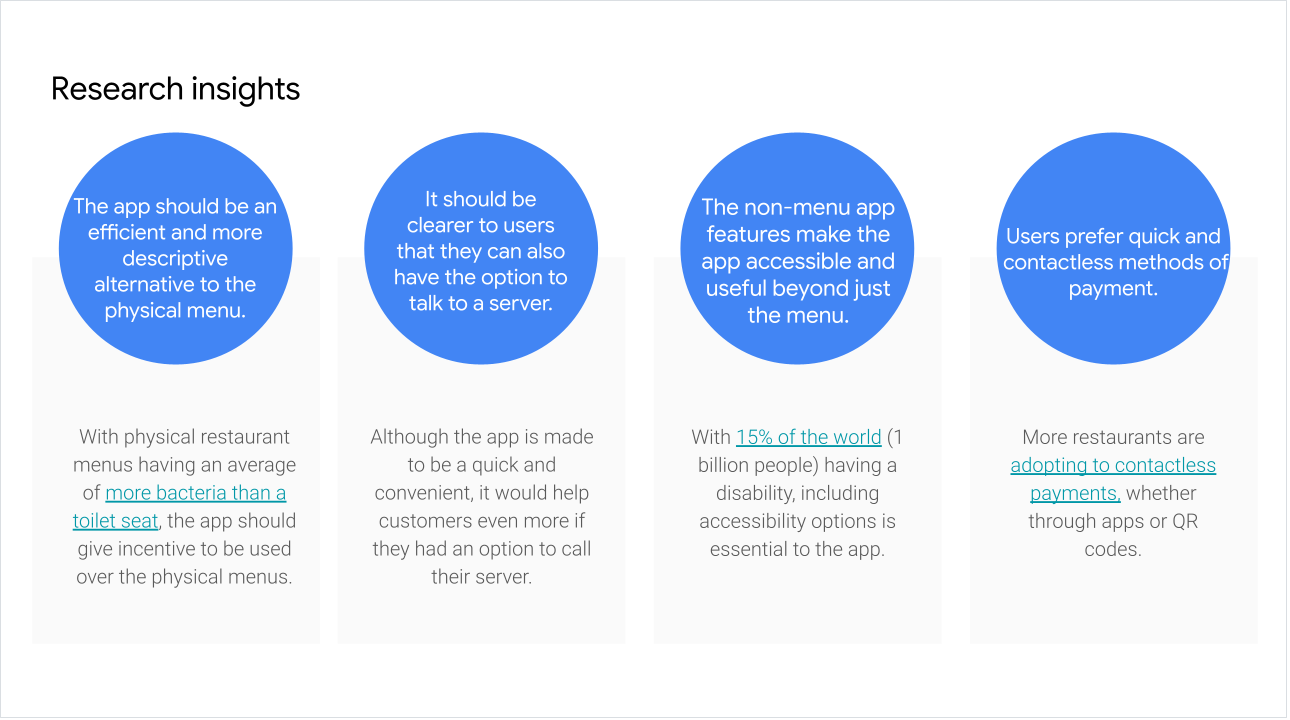
Sources: ABC News, World Health Organization, PRWeb
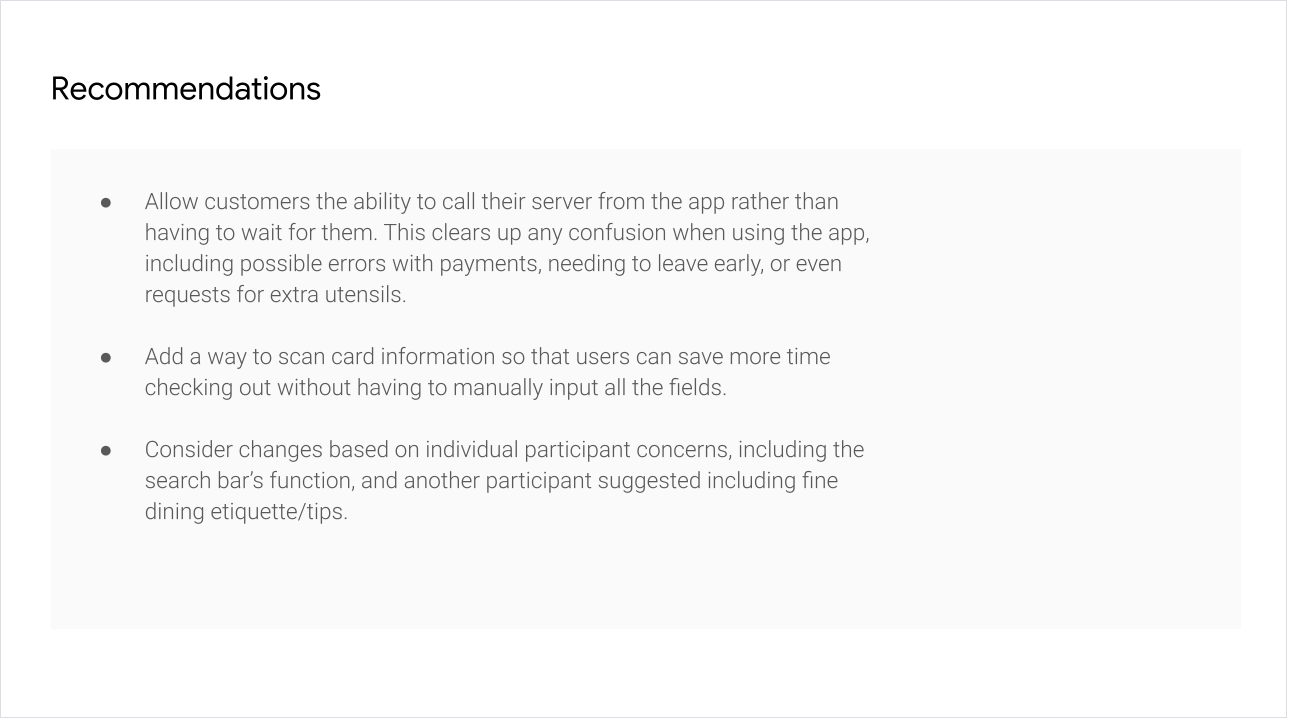
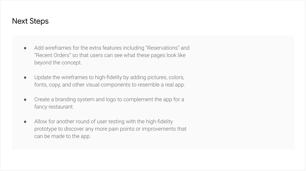
Improvements


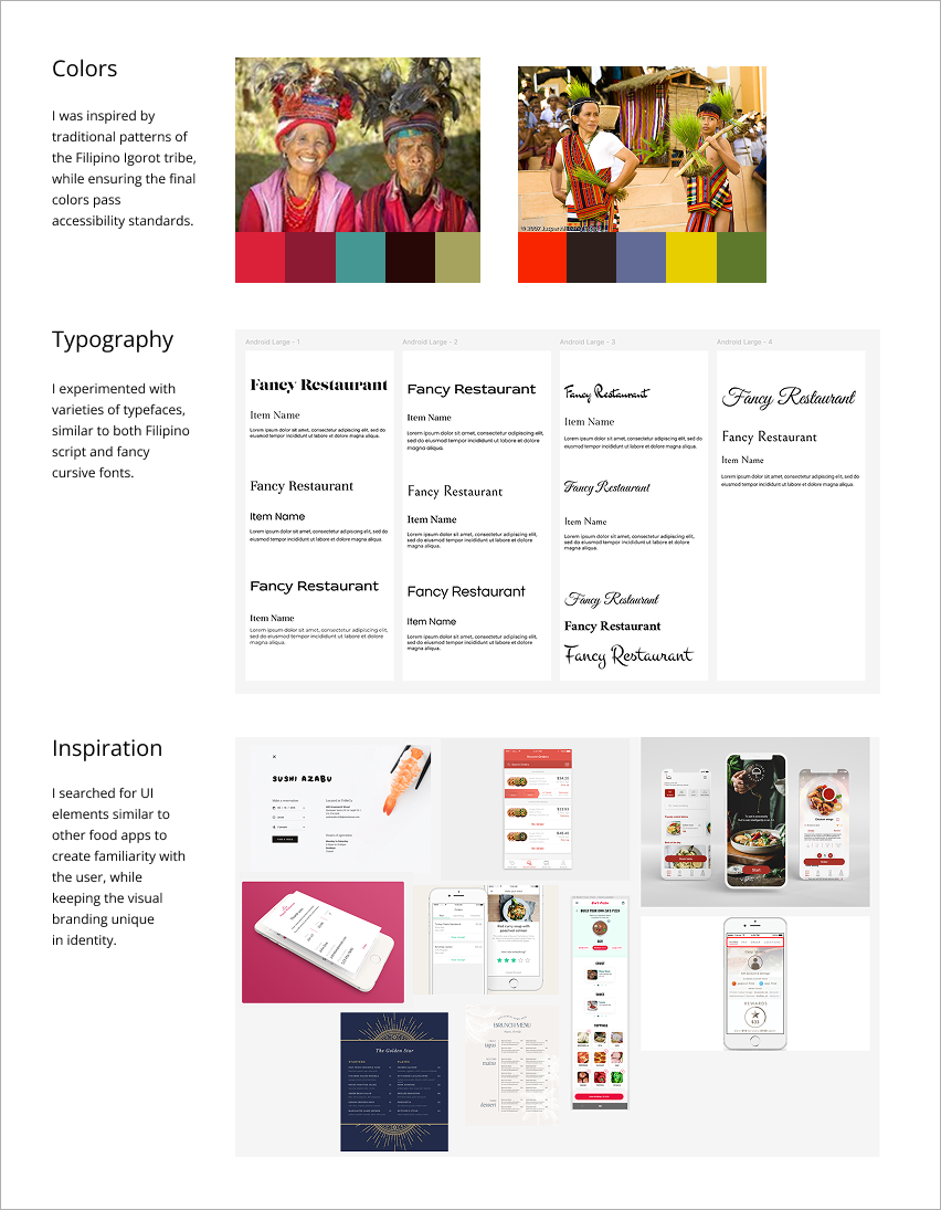
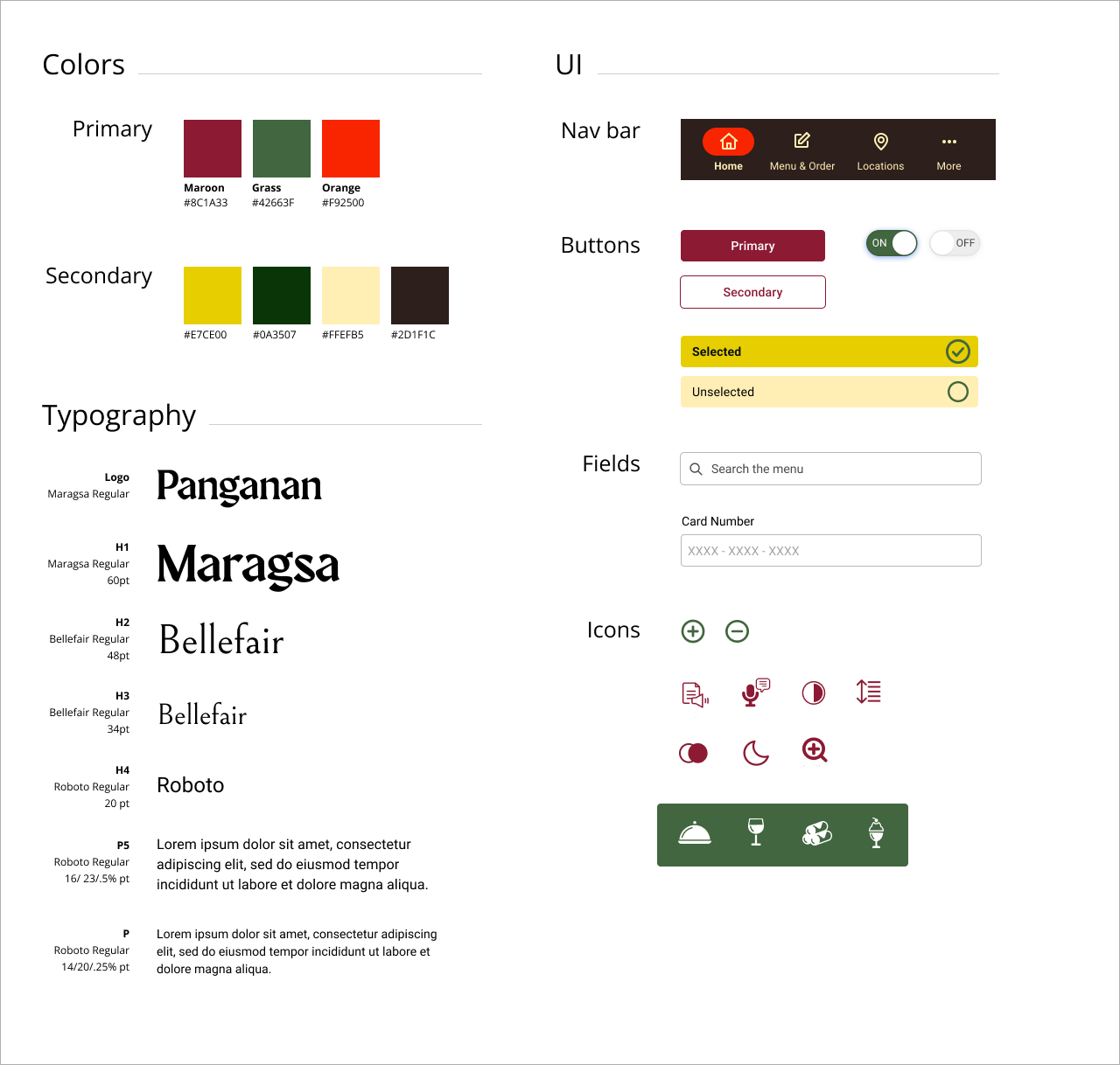
Developing Visual Identity
Visual Approach
UI Style Guide
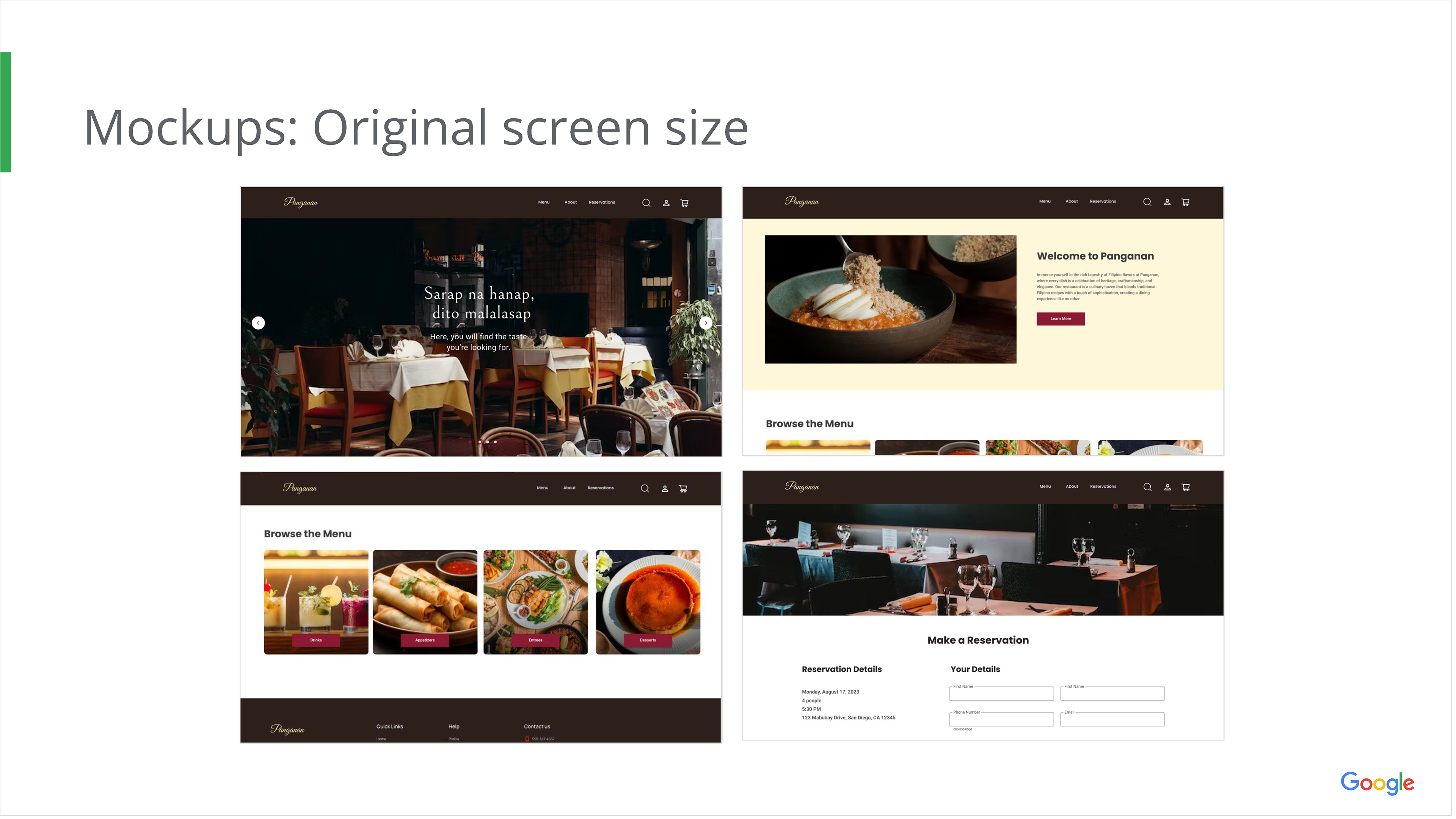
Screens
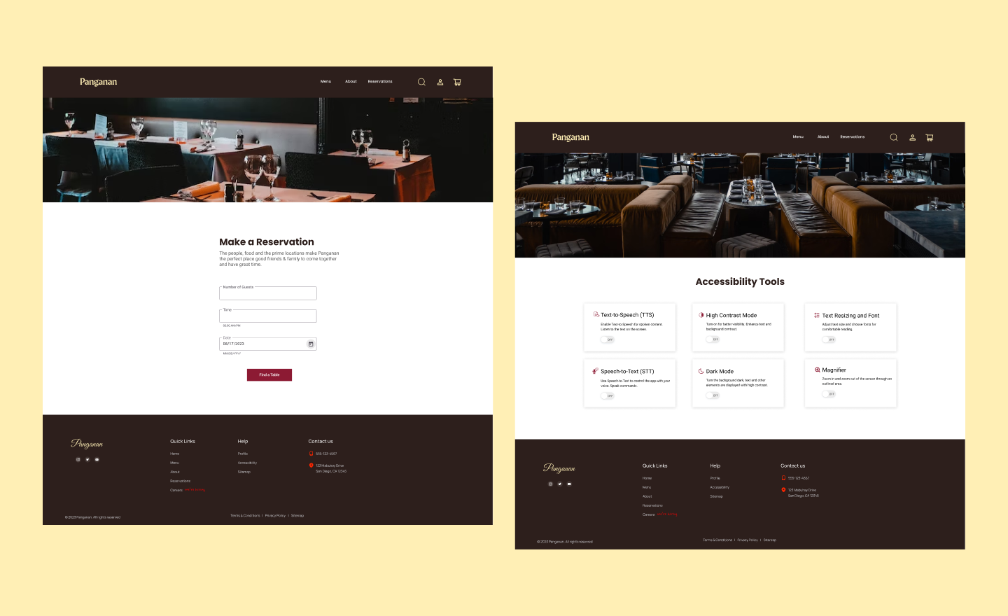
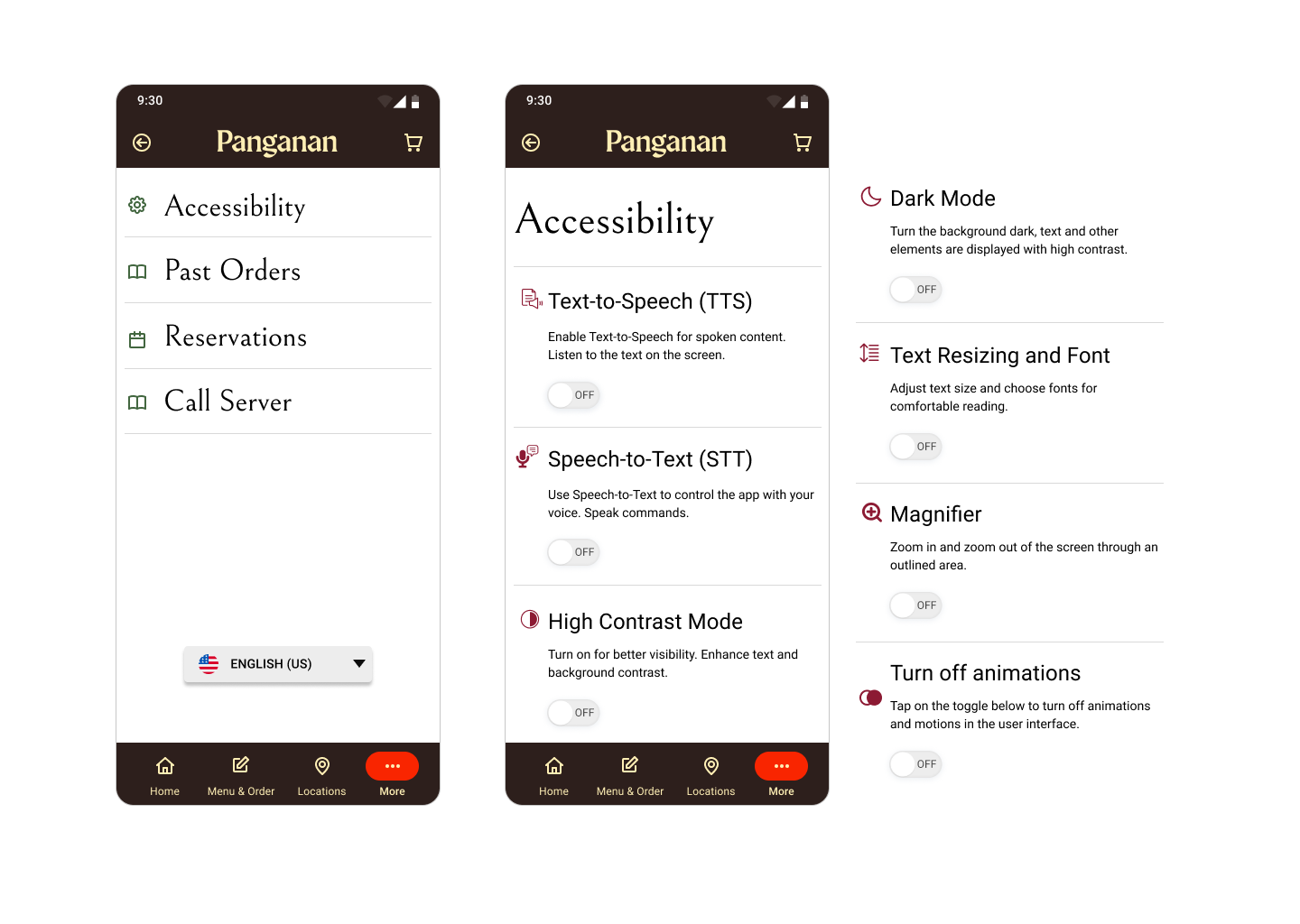
Accessibility
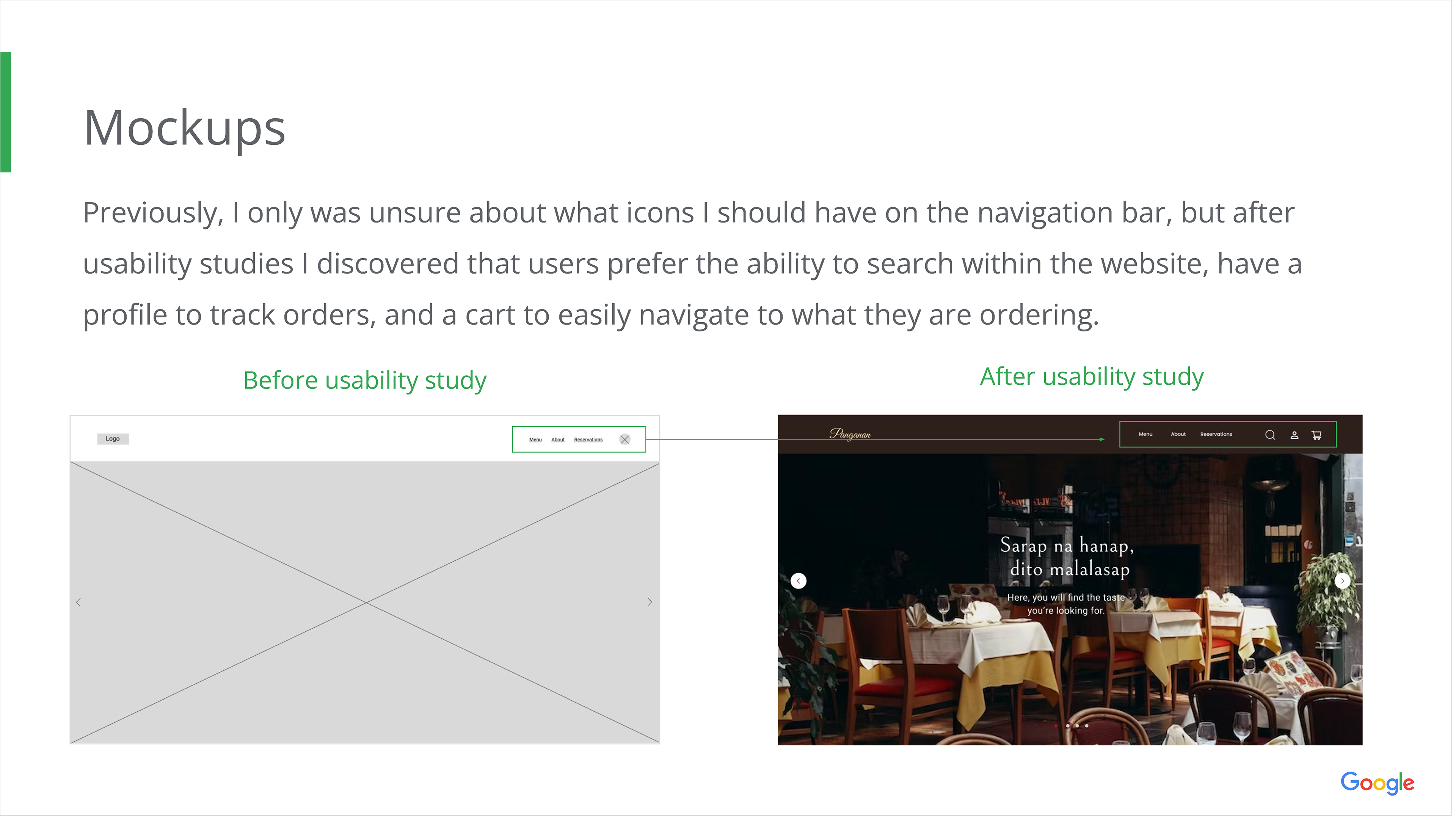
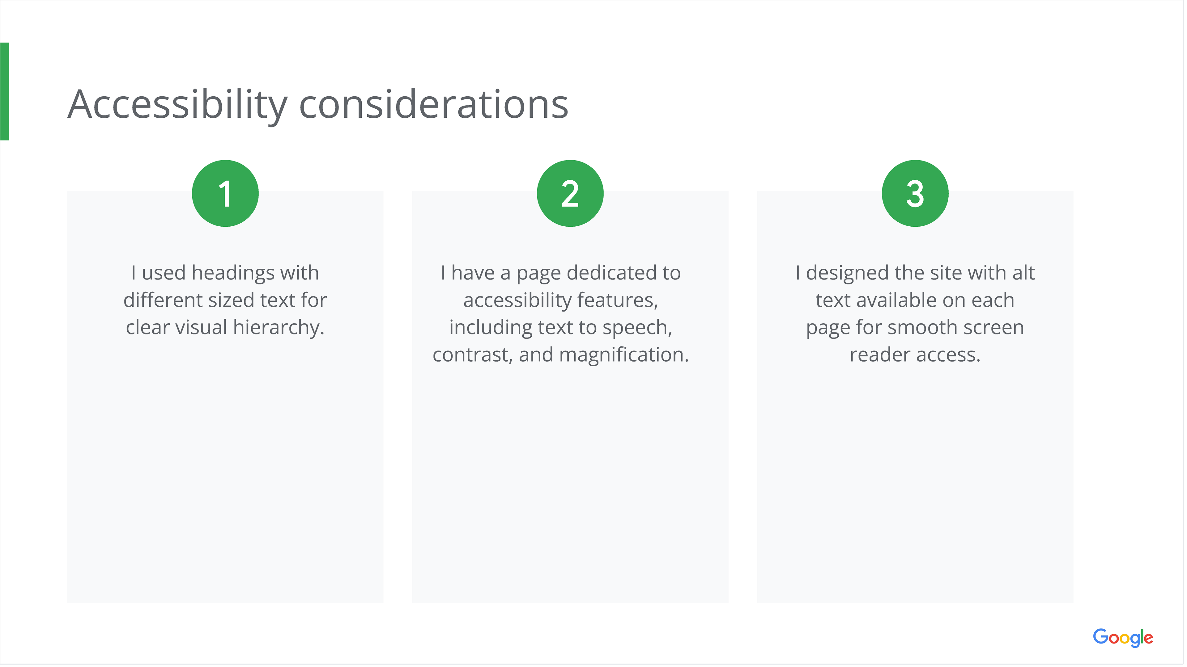
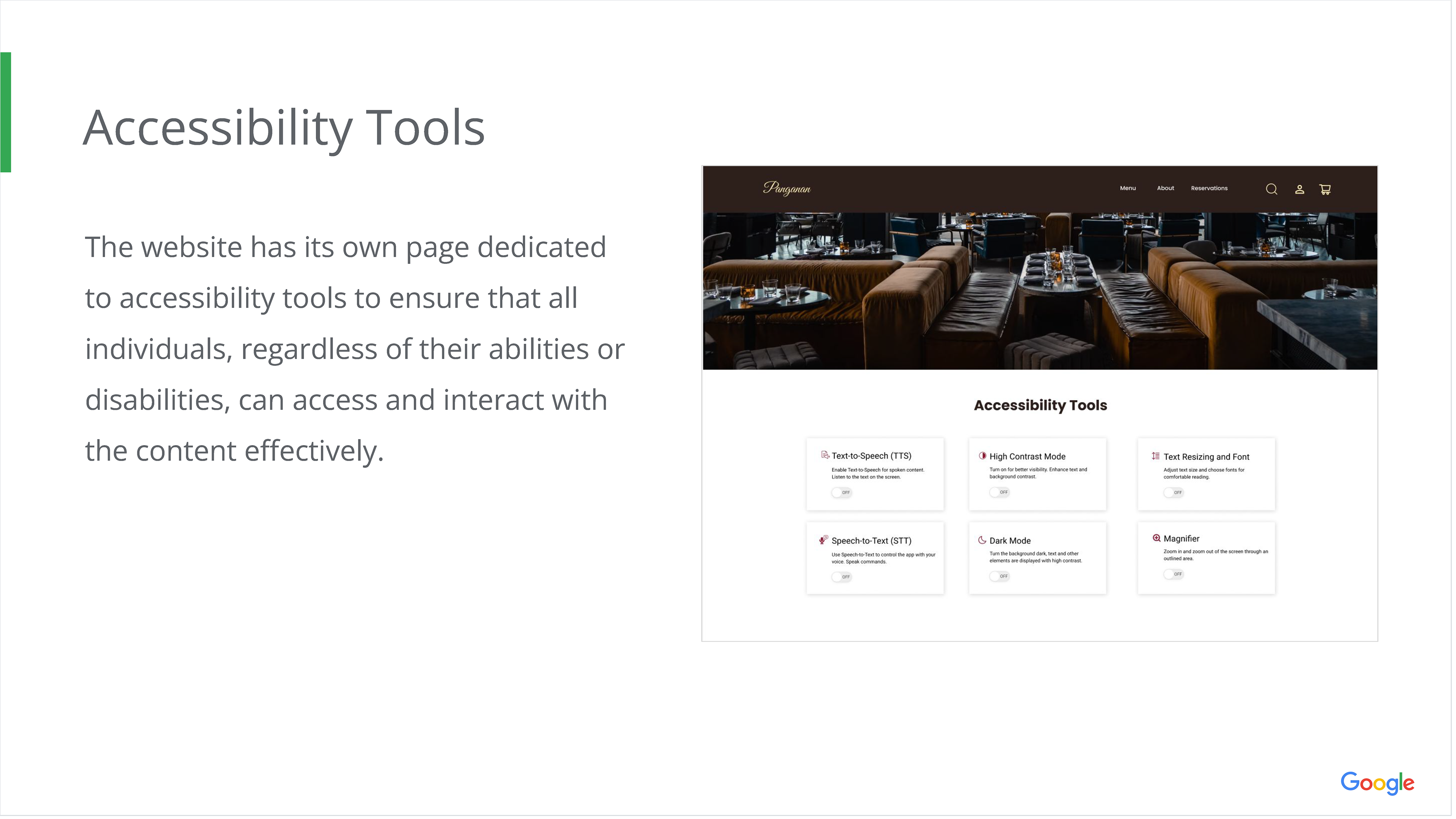
The first priority in developing any app should be the accessibility features and consideration of needs for the user. The Panganan app is designed to have a page dedicated to possible accessibility functions, one being "Dark Mode" which may be helpful in high-end restaurants that tend to have darker lighting.
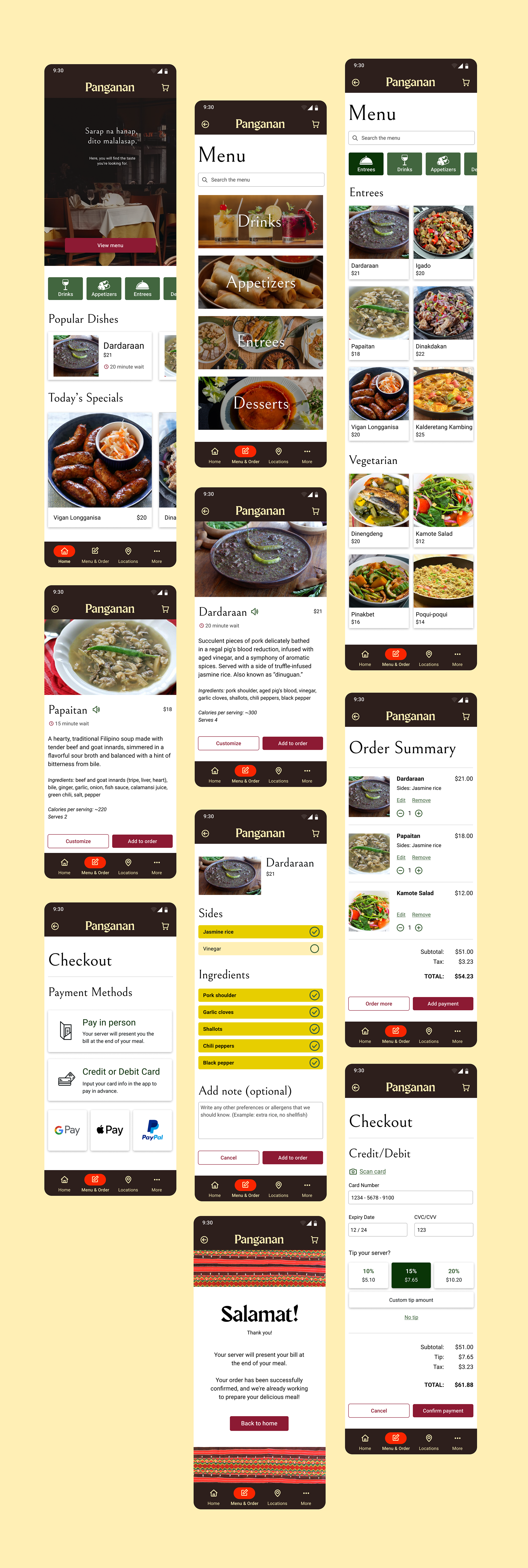
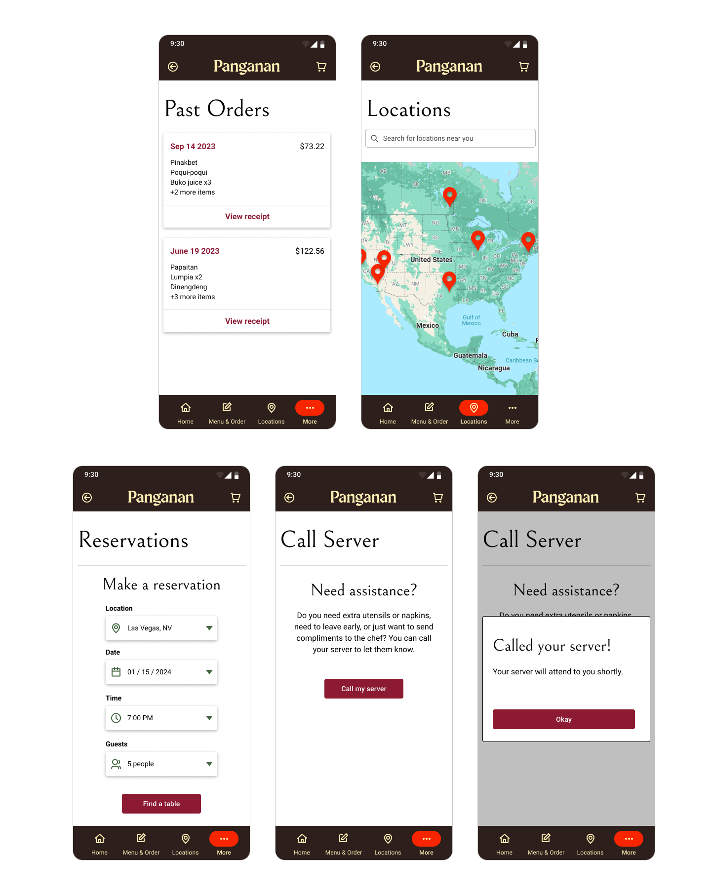
Main Flow & Other Pages
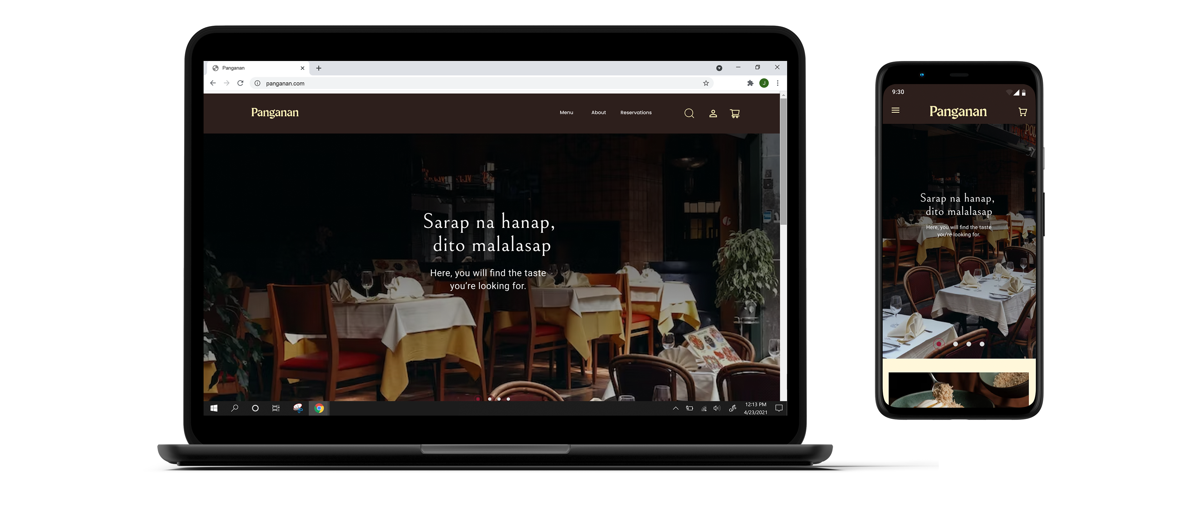
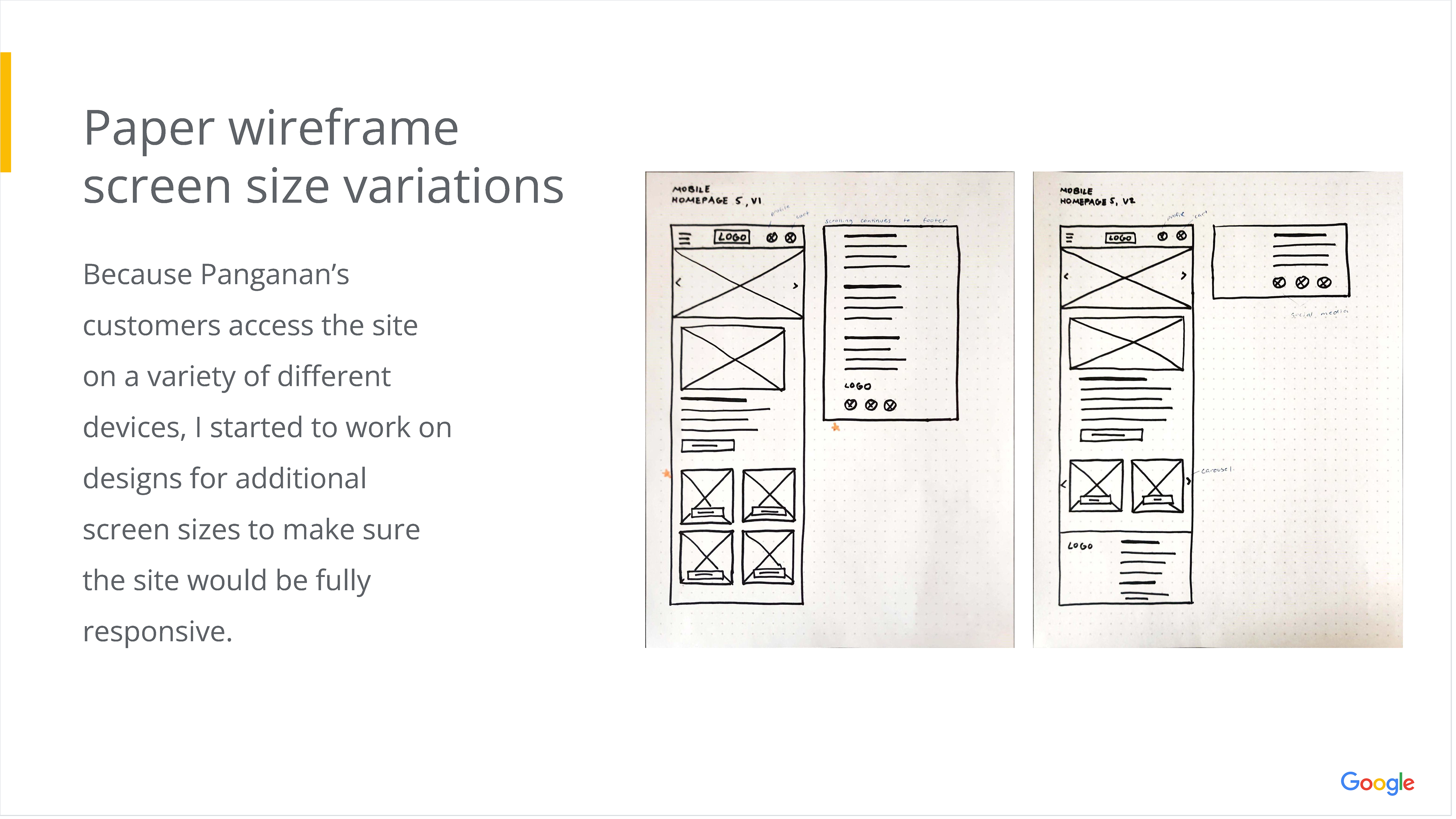
Part 2: Responsive Website
Overview
The second phase of this project involved creating a responsive website alongside the app, following the full UX design process: empathize, define, ideate, prototype, and test.


Understanding the User


Starting the Design


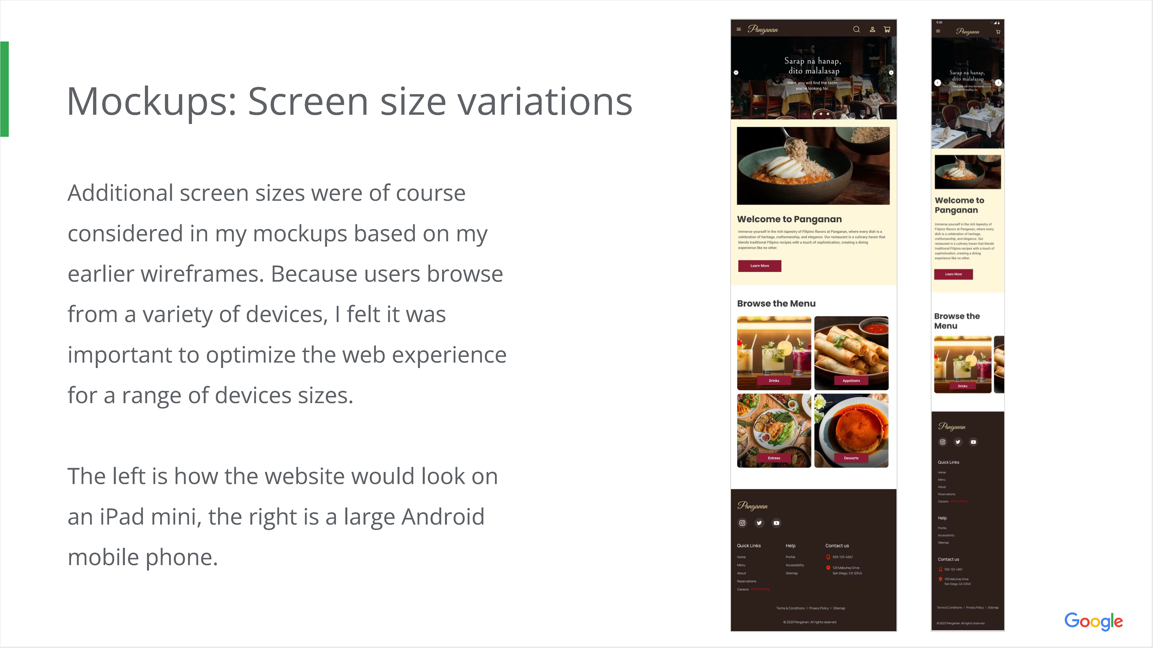
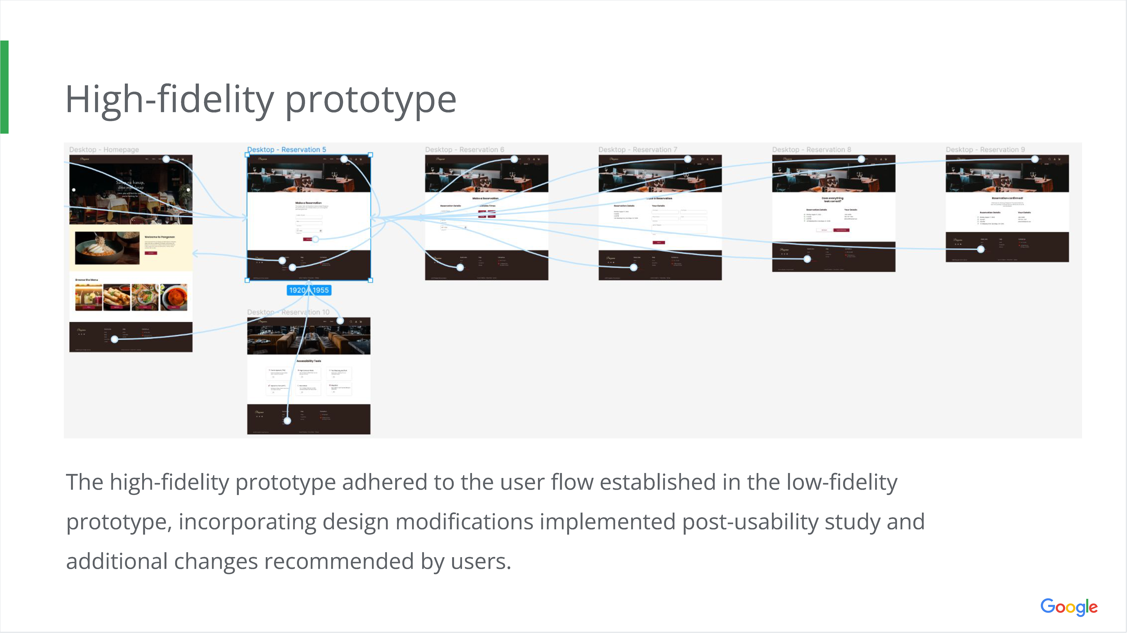
Refining the Design